 Online: 16677
Excel > Charts
2D & 3D Pie Chart in Excel
How to create 2-D and 3-D Pie chart, filter and add style to chart in Excel?
In last post, we learnt about creating Line chart in Excel. In this post, we shall learn how to create Pie chart, add filter and style to it.
2-D Pie Chart
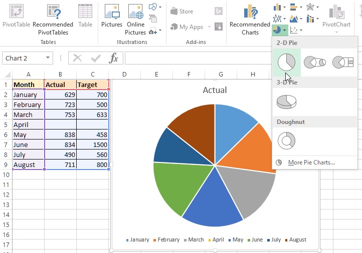
To create 2-D Pie chart in Excel, first select the Chart data and go to INSERT menu and click on 'Insert Pie or Doughnut Chart' command dropdown under Charting group on the ribbon.
You will see a Pie chart appearing on the page as displayed in the picture below. Notice that Pie chart can only show one type of data (In this case either Actual or Target). The default is immediate data after the label, in this case it is 'Actual', to know how to show 'Target', read the Chart filter topic below.

Pie Chart Style
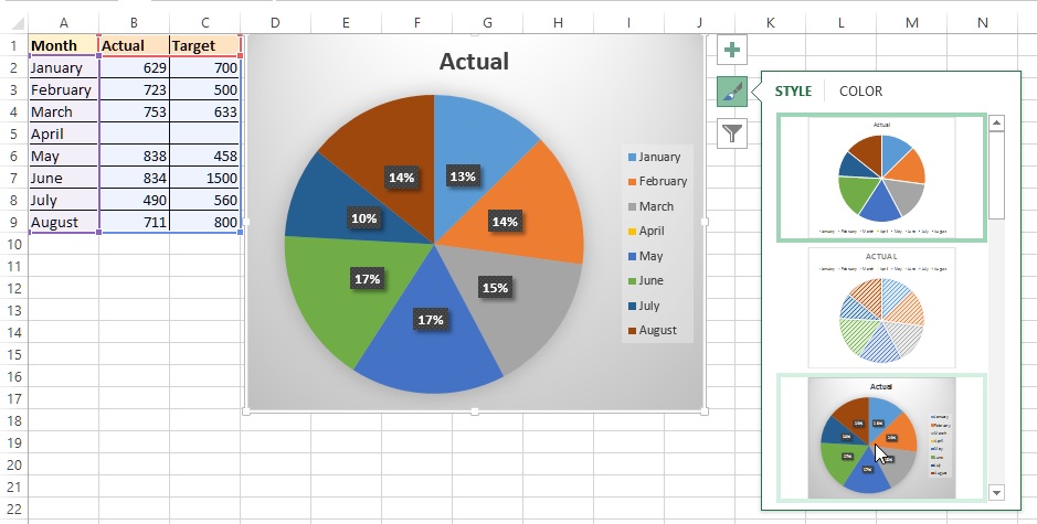
To add style to this chart, click on the chart and select 'Chart Styles' command button at the top-right corner of the chart as displayed in the picture below. Scroll through styles and you would see the preview of each styles.
Similarly to change the color scheme, click on the COLOR tab and select different color schemes.

Pie Chart Filter
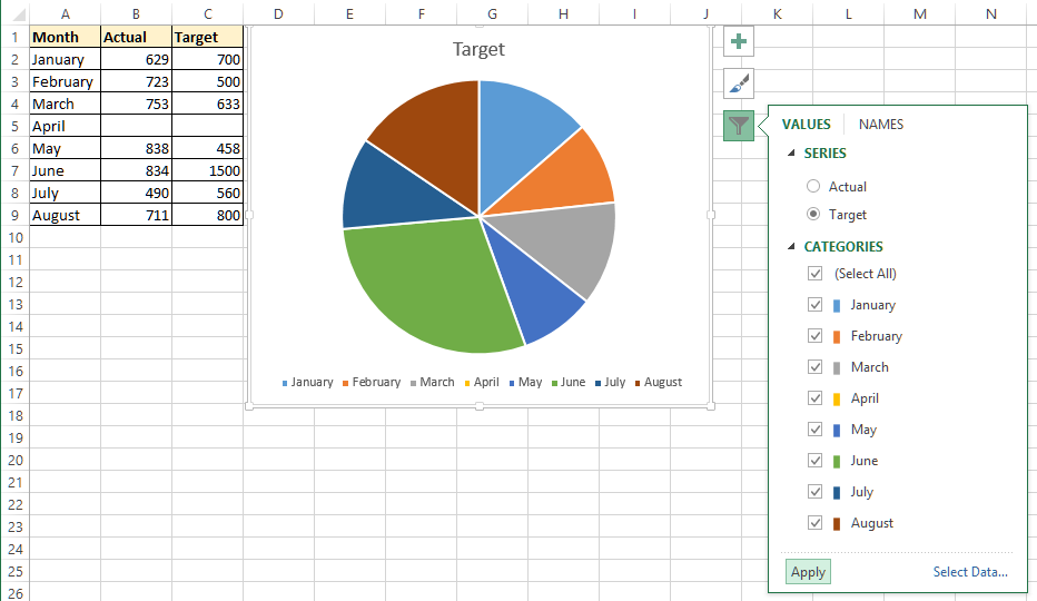
To add filters to the Pie chart, click on the chart and select 'Chart Filters' command button at the top-right of the chart as dislayed in the picture below.
To plot the Target data on the chart, select 'Target' series radio button and click 'Apply' button. Similarly, to hide any of the months plots on the chart de-select he checkbox and click on Apply.

3-D Pie Chart
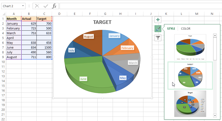
To create 3-D Pie chart, select 3-D Pie chart from Insert Chart dropdown (Look at the 1st picture above). To select different types of 3-D Pier chart, click on the 'Chart Style' command button and select through different styls.

Thanks for reading. Hope you liked this post, do share!
Views: 22747 | Post Order: 48


