 Online: 11577
Excel > Charts
Sparkline Chart in Excel
How to create Line, Column and Win/Loss Sparkline charts in Excel?
In last post, we learnt about 2D & 3D Bubble Chart in Excel. In this post, we shall learn how to create Sparkline chart in Excel.
Sparkline Chart
Sparkline chart is a mini chart placed in a single cell, each representing a row of data in the selection. To insert a Sparkline chart, go to 'INSERT' menu and from the 'Sparklines' group, select the first one that says 'Line' as displayed in the picture below.

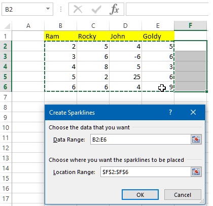
This will open up 'Create Sparklines' dialog box as displayed below. Now click on the 'Data Range' text box icon that will let us select the data range for which we want to create the Sparkline chart. The selection can easily be done by dragging the mouse from B2 through E6 and pressing Enter key.

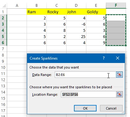
The next step is to click on the 'Location Range' text box icon and select the location (from F2 to F6) so that for each row, the sparkline appears in the F column.

Now, click on OK button and that creates Sparkline chart in the F column cells as displayed below.
Designing and Styling the Sparkline chart
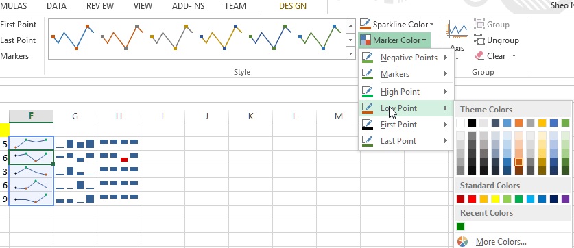
To design the Sparkline chart, click on the Sparkline chart cell and you will notice that a 'DESIGN' menu appears in the last of the menu bar as displayed below.
Select appropriate chart style, color and markers.

The G and H columns are 'Column Sparkline Chart' and 'Win/Loss Sparkline Chart' respectively. They have been explained below.
Column Sparkline Chart
To create 'Column Sparkline Chart', follow the same as above step. Just click on the 'Column' button and follow exactly same step as described above.

Win/Loss Sparkline Chart
To create Win/Loss sparkline chart, follow the same step as to create Sparkline chart, just click 'Win/Loss' button and follow exactly same step as above.

The styling and other formatting steps remain same for all the charts as explained in the 1st case above.
Thanks for reading. Do share with your friends and colleagues !
Views: 10992 | Post Order: 53


