 Online: 24186
Excel > Charts
Easy Pareto Chart in Excel
How to create Pareto chart easily in Excel?
In last post, we learn how to create Gantt chart in Excel. In this post, we shall learn how to create Pareto chart in MS Excel.
Pareto Chart
Pareto chart is named after 'Vilfredo Pareto', it is a type of chart that contains bar chart in descending order for individual values and line chart for cummulative total value.
Pareto chart is generally used to analyze the most significant problem and it works on 80-20 principal, ie. 80% of the problem caused by 20% of reasons.
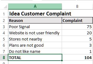
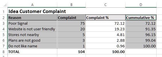
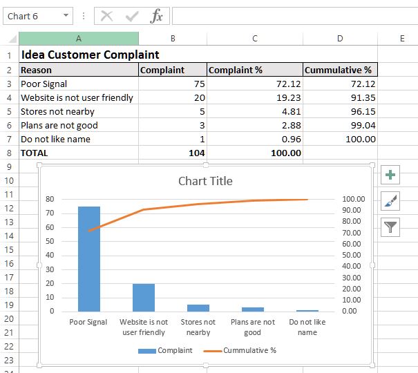
Here is a sample data of the Pareto chart for Idea telecom services customer complaints (not real data).
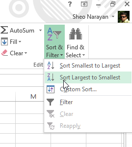
First sort the data in descending order using Sort & Filter button on the ribbon under HOME menu. Select any cell of 'Complaint' column and click on 'Sort Largest to Smallest' dropdown as displayed below.
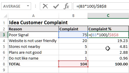
Now, it's time to get the perentage of each complaints from the total of complaints. So get the total of Complaints and then get the percentage as displayed in C3 cell below. Copy the C3 cell formula to other C column cells to get respective rows percentages.
Now, get the cummulative Complaints %. In D4, write '=C4+D3' to get the cummulative and copy the same formula to other D cells.
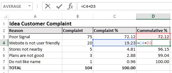
Now, we have necessary data ready to create Pareto chart.
Select Column A, B and D. To do this, drag the mouse by holding mouse left key from A2 to A7, now hold CTRL key on keyboard and drag the mouse by holding mouse key from B2 to B7, keep holding the CTRL key on keyboard and drag the mouse by holding mouse key from D2 to D7.
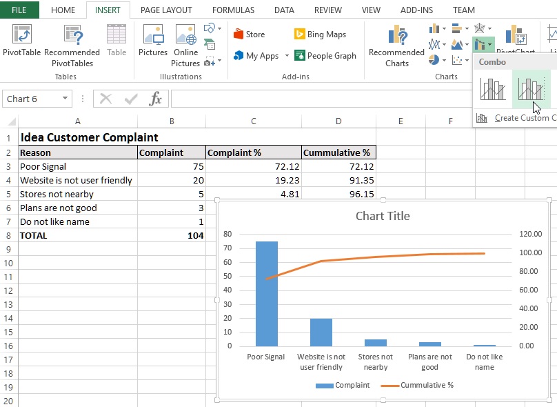
Now go to INSERT menu and notice the 'Charts' group. Click on 'Insert Combo Chart' dropdown button and select 'Clustered Column - Line or Secondary Axis' chart as shown in the picture below. This should insert a Chart at the center of the spreadsheet as shown below.
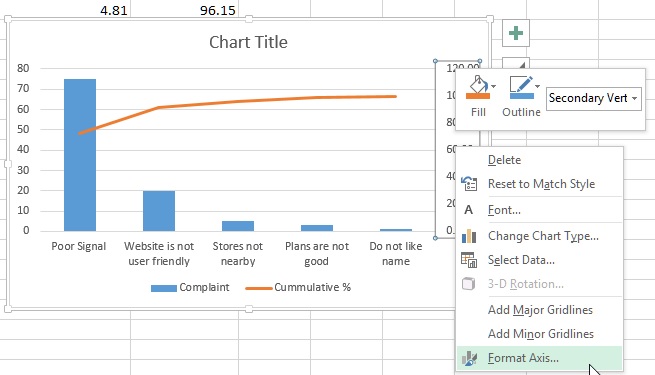
Now select the Secondary Axis (right side axis) by clicking it and right click to select 'Format Axis...'.
From the right side panel, change the value of 'Maximum' under 'Bounds' to 100.0. (as we are getting the % of complaints from 100).
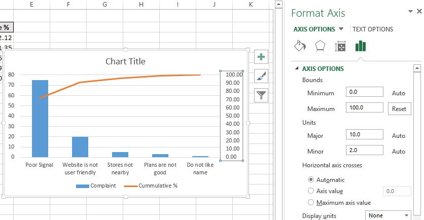
Our Pareto Chart is almost ready, you may add style, filter and elements as per your requirements to make it more appealing.
Below is the final Pareto chart after following above steps.
Hope this post was useful, thanks for reading.
If you liked it, please help others to learn by sharing this post.
Views: 10011 | Post Order: 56


