 Online: 24147
Excel > Charts
Gantt Chart in Excel
How to create Gantt chart in MS Excel?
In last post, we learnt how to create Thermometer chart in MS Excel. In this post, we shall learn how to create Gantt chart in MS Excel.
Gantt Chart
There is no Gantt chart inbuilt in MS Excel. We basically create Stacked Bar chart and custmoize it to give Gantt chart look & feel.
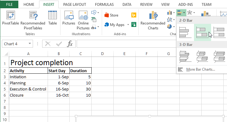
For this demonstration, we have data as shown below for a Project completion. Do not select the data, just go to INSERT menu and click on 'Insert Bar Chart' dropdown to select 'Stacked Bar' chart. This will insert a blank chart at the center of the spreadsheet.
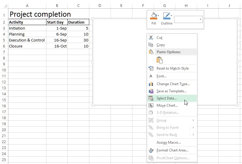
Now, right click the blank chart and select 'Select Data ...' that will open up 'Select Data Source...' dialog box.
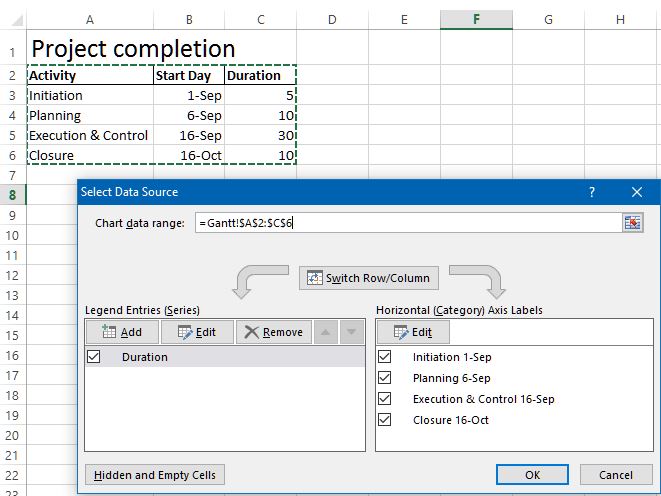
In this dialog box, click on the 'Chart data range:' text box right side icon and choose the range from $A$2:$C$6 that contains our data for which we want to create Gantt chart. Remember that this is the absolute reference of the cells.
Now, click on 'Add' button under 'Legend Entities (Series)' that will open up 'Edit Series' dialog box as shown below.
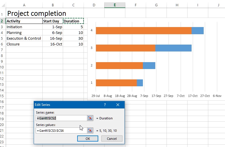
Remove all the data from text boxes on this dialog box.
Click on 'Series name:' text box right side icon and select the series name, now click the right side icon of 'Series values:' text box and select that series values.
Quickies  Ideally, you should be editing the default series that appears as 'Duration' to 'Start Day' data and then click 'Add' button to add 'Duration' series.
You should have two values in the 'Legend Entities (Series)' as shown below (Ignore the right side box on the dialog box for now).
You may not be able to select the Series properly in one go so remove it and try it multiple time untill you are able to get it perfectly.
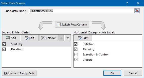
Important  :
:
Please ensure that all data in the series are calculatable (on which calculation can be performed). For example, 'Start Day' data must be of date type in this case. If not, format the cell acordingly.
Now, it's time to change the Axis labels, When you open 'Select Data Source' dialog box, you may notice that right side box 'Horizontal (Category) Axis Label' may have '1.2,3 etc. that is not meaningful in this context.
So click on 'Edit' button under 'Horizontal (Category) Axis Label' to open 'Axis Labels' dialog box. Click on right side icon of 'Axis label range:' text box and select the cell from A3 to A6.
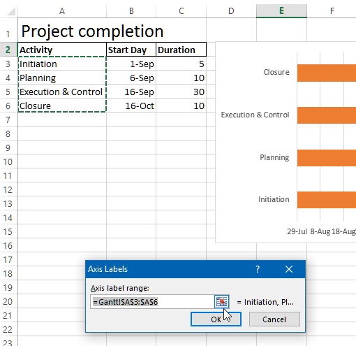
So our chart should be looking like this (this chart is final product after following step, actully the Y axis Label will be in reverse order). So click to select the Axis Labels (Initiation, Planning etc.) at the left of the chart and select 'Format Axis...', that will open right panel that will allow us to format the Axis.
Check the 'Category in reverse order' check box to bring the category in reverse order so that project completion steps starts from begining to end.
Now, select the blue stacked bars ie. Start Day (You may need to click on Blue stacked area to select all of them at once or select one by one) and from right side panel under 'Fill', select 'No Fill' radio button, this will make the stacked bar transparent.
Your final chart should be looking like this. If you want to format other axises, click on them and format from 'Axis Options' from right side panel as shown below.
Thanks for reading, hope this was useful.
Do share this tutorials to your social networks!
Views: 9652 | Post Order: 55


