 Online: 2013
Excel > Pivot Table
Pivot Table & Pivot Chart in Excel
How to create Pivot Table and Pivot Chart in MS Excel?
In previous posts, we learnt about different types of Charts in Excel. In this post, we shall learn how to create Pivot Table in MS Excel.
Pivot Table
Pivot table is the most important and powerful feature of MS excel, it is used to extract useful information from tabular data set (in general large data set).
Below is an example of data set of Indian Companies shares bought and sold. Let's try to extract some meaningful information from this data using Pivot Table.
Click on any cell of the data to select it and go to INSERT tab and click on 'PivotTable' button on the ribbon.
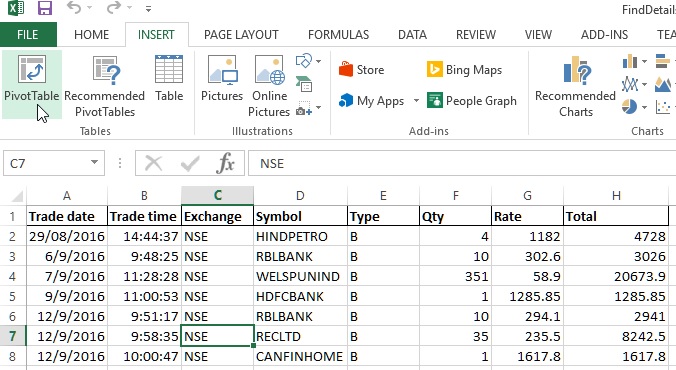
This will open up 'Create PivotTable' dialog box as shown below. By default, the entire data range of the data set on the spreadsheet is selected as 'Table/Range' under 'Choose the data that you want to analyze' heading.
Now, look at other heading 'Choose where you want the PivotTable report to be placed'. We have two radio buttons, by default 'New Worksheet' radio button is selected (if we want the PivotTable to appear in new worksheet). To create PivotTable report in existing spreadsheet, select 'Existing Worksheet' radio button and click on 'Location' text box right side icon to select the cell where we want our PivotTable report to appear.
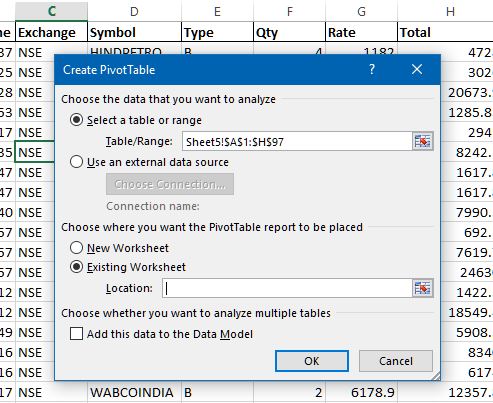
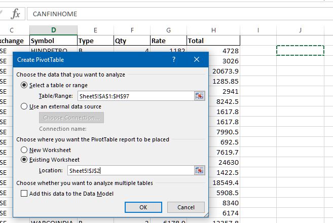
Click on J2 cell and press Enter to choose the target location of the Pivot table. Now click on OK on the 'Create PivotTable' dialog box.
This will open the 'PivotTable Fields' panel at the right side of the spreadsheet.
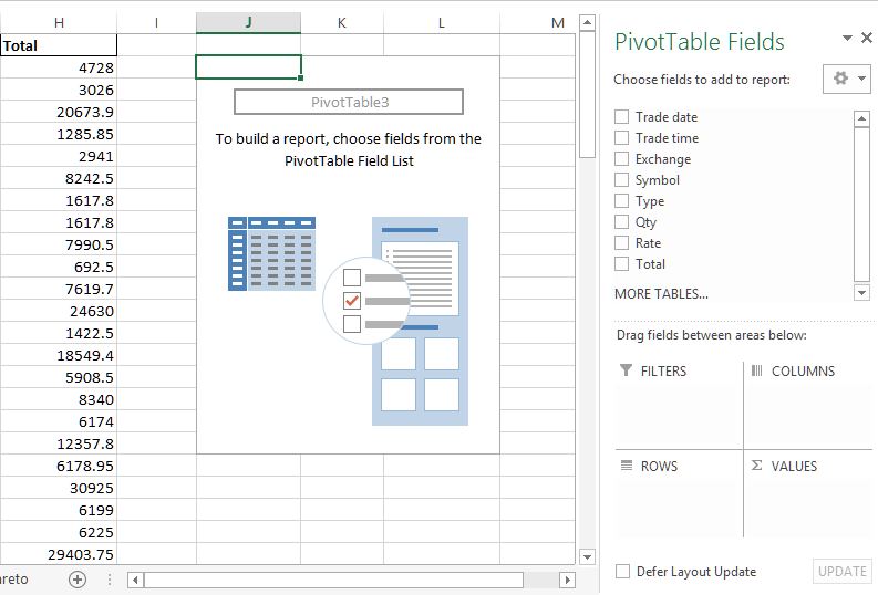
Depending on what fields we want to analyze and in what form, we can check the Fields checkboxes. Below the Field list we have 4 sections (FILTERS, COLUMNS, ROWS and VALUES). We can also drag the Fields to appropriate areas to display the report in the form we want.
Below we have selected Symbol, Qty and Total that gives the total of Qty and Total for each company.
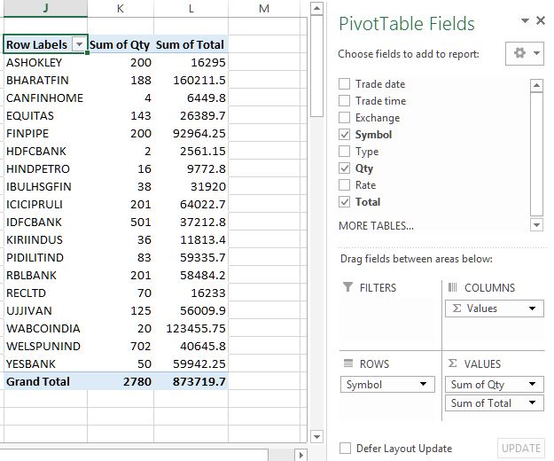
You may notice that this report is not giving correct report as our data has Type column (B = Buy, S = Sell) of the companies shares so we may want to filter the reports based on this. We can do this by dragging the Type field in the FILTERS area.
Filtering Pivot Table
To filter Pivot Table data based on certain field, click on the Field and drag that to FILTERS area as shown below. In this case, I have dragged 'Type' field.
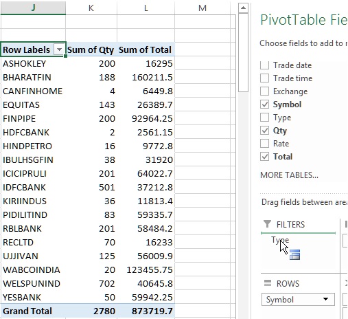
A row just above the top of the report appears as shown below (highlighted with yellow color). Currently, no filter is applied as '(All)' is selected in the K column.
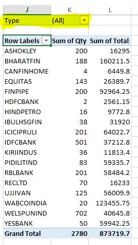
Click on the 'All' dropdown to see the unique values of 'Type' column, select any one of them (in this case I have selected 'B') and click OK button.
The Pivot Table report gets filtered based on the selected data. The result of above filter is below, it shows only those records whose 'Type' is 'B'.
Pivot Chart
Apart from just Pivot Table report, we can also create Pivot Chart that is directly connected to the Pivot Table report. Any change to the Pivot Table reports changes the Chart in real time.
To create dynamic Pivot Chart, click on any cell of the Pivot Chart and go to 'INSERT' menu and under 'Charts' group, select 'Insert Column Chart'.
This will show a chart based on current data on the Pivot Table report. We can start filtering the Pivot Table data as well as Pivot Chart directly by drop down buttons available on the chart (highlighted).
Analyzing and Designing Pivot Table
To analyze, format and design the Pivot table in more different ways, we can use contextual tabs (ANALYZE and DESIGN) that appears when we click any of the cell on the Pivot Table. See below.
To sort the Pivot Table columns, simply use the Ascending or Descending buttons in the 'DATA' tab.
Take this as home work and see if you can learn both tabs yourselves.
Thanks for reading and learning.
If you liked it, do share with your friends and in your social circles  !
!


