 Online: 11589
Excel > Charts
Thermometer Chart in Excel
How to create thermometer chart in MS Excel?
In last post, we learnt how to create Sparkline chart in MS Excel. In this post, we shall learn how to create Thermometer chart in MS Excel.
Thermometer Chart
Thermometer chart is used to show how much of a goal has been achieved or what is the current status of work.
Let's make a sample data first. Below is the Actual and Target column and the corresponding data for month is written.
13th row is the total of both columns. On C15 cell, we have taken out the percentage of Actual work completed.
Now select the C15 cell and go to INSERT menu and click on 'Insert Column Chart' dropdown under 'Charts' groups and select 'Clustered Column' chart.
A chart appears at the center of the sheet.
Now delete the Chart title and Legends if any. Now right click on the Bar (click to Select if not selected) and then select 'Format Data Series...' to bring the right side panel. Change the 'Gap Width' to 0 and resize the to look is vertical.
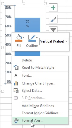
Now select the Label and right click and select 'Format Axis...'.

In the right panel, change the 'Minimum' bound to 0 and 'Maximum' bound to 1.
Your final Thermometer chart should look like this
You can choose different variant and style of this chart from 'DESIGN' menu that only appears when you have selected the chart. To change the color, use 'Format Data Series' right panel and select desired tabs.
Hope this post was useful. Do let us know your feedback or comment and if you liked it share to your social channels for others to get benefited.
Views: 12390 | Post Order: 54


