 Online: 22272
Excel > Charts
Secondary axis chart in Excel
How to create a secondary axis chart in MS Excel?
In last post, we learnt about creating combination chart in Excel. In this post, we shall learn how to create secondary axis on Excel chart so that chart with different magnitude make sense.
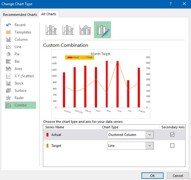
To do this, select the chart by clicking on it and select 'Change Chart Type' from the 'DESIGN' menu and click on 'Combo' option from the left panel (on dialog box).
Now from top panel (on dialog box), select anyone depending on what variance of chart you are looking for.

Just below the preview on this dialog box, you see 'Series Name', 'Chart Type' and 'Secondary Axis' columns. Click on the 'Secondary Axis' checkbox for respective series to bring that series in the secondary axis.
Here is the result.
Hope you liked this post, do share where and whomever you like!
Views: 6156 | Post Order: 44


