 Online: 4587
Excel > Charts
Combination chart in Excel
How to create a combination chart in MS Excel?
In last post, we learnt about changing chart type and switch row/columns in Excel. In this post, we shall learn how to create combination chart.
Combination chart in Excel
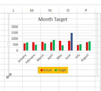
Combination chart is the combination of two different types of chart so that the data comparision is easy. If we look at below chart, we may feel difficulty to see the contrast between two columns and may not easily know the difference between the Actual and Target.

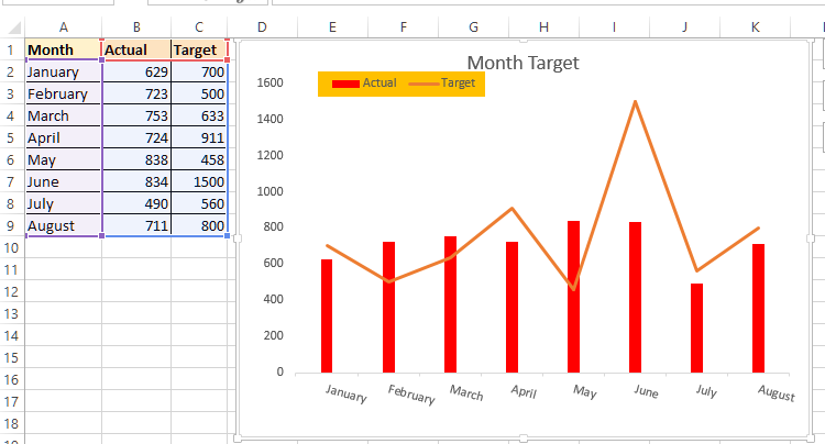
In Combination chart, we can chart Actual as column and Target as line chart so that the contrast between the two is visible clearly.
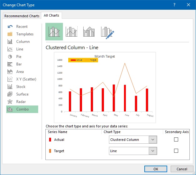
To do this, select the chart by clicking on it and select 'Change Chart Type' from the 'DESIGN' menu and click on 'Combo' option from the left panel. Now from top panel select anyone depending on what chart you are looking for.

In this case, by selecting the 1st 'Clustered Column - Line', we get following chart. This chart clearly indicates the difference between Actual and Target and it's very easy to understand.

Thanks for reading, do share this post if you liked!
Views: 6049 | Post Order: 43


