 Online: 14088
Excel > Charts
Chart axes, legend, data labels, trendline in Excel
How to work with chart axes, legends, data labels and trendline in MS Excel?
In last post, we learnt about how to create a chart and format it in excel. In this post, we shall learn how to work with chart legends, data labels axes etc.
Hide/show Axes in Excel chart
Many a times, we may need to hide/show horizontal or vertial axes labels in the chart. To do this, go to 'DESIGN' menu and click on 'Add Chart Element' dropdown command. Select 'Axes' and then choose either 'Primary Horizontal' or 'Primary Vertical' commands. Note that these are toggle commands, so clicking once will hide the axes and again clicking will show.
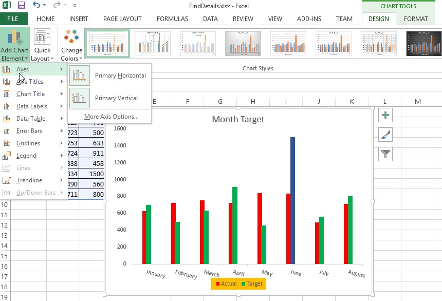
Clicking on 'Primary Horizontal' will hide the horizotnal axes from the chart as shown below.
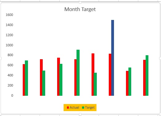
Clicking again will show the horizontal axes of the chart.
Removing excel chart title
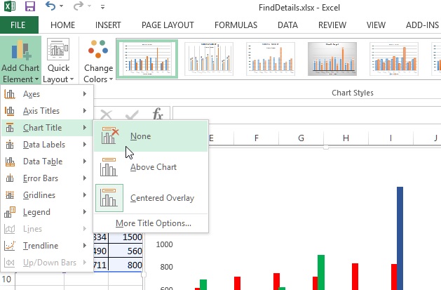
To remove the chart title from the chart, select 'DESIGN > Add Chart Element > Chart Title > None'. To move the Chart title position, select 'Above Chart' or other options.
Clicking on 'More Title Options...' will open up right panel that allows many more options to format or position the chart title.
Positioning Data Labels
To position the Data Labels in excel, select 'DESIGN > Add Chart Element > Data Labels > [appropriate command]'.
For example, in below example, the data label has been positioned to Outside End.
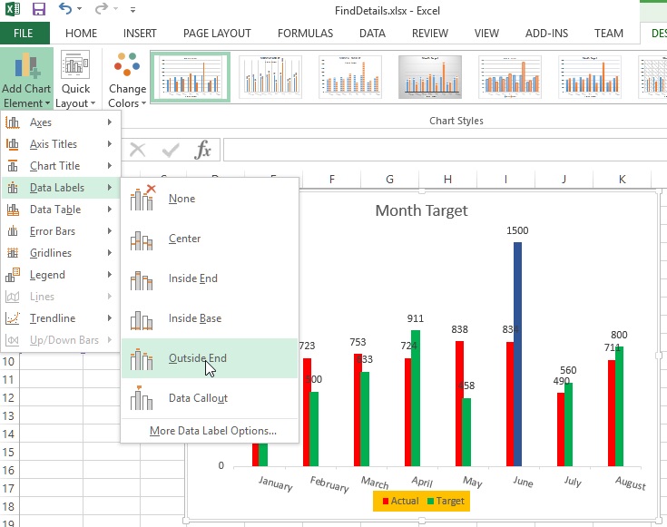
To format the Data Labels, select 'More Data Label Options...' and select approproate formatting from right side panel.
Bringing Data Table on the chart
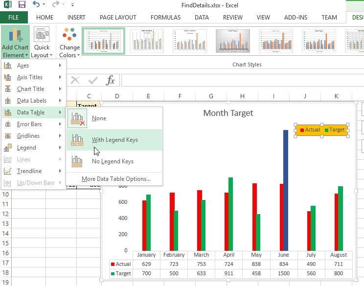
To bring the Data Table on the chart, select 'DESIGN > Add Chart Element > Data Table > [appropriate options]'.
For example, to bring the data table with legend keys as displayed in the picture; select 'With Legend Keys'.
Gridlines on Excel Chart
To bring gridlines on Excel chart, select 'DESIGN > Add Chart Element > Gridlines > [appropriate options]'.
To bring minor horizontal gridlines, select 'Primary Minor Horizontal' and the result would be something like this.
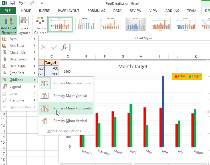
Chart legend positioning
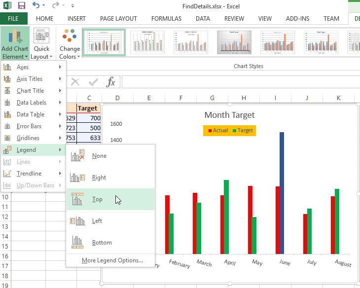
To change the positioning of the chart legend, select 'DESIGN > Add Chart Element > Legend > [appropriate options]'.
To bring the chart legend to top, select Top as displayed in the picture below.
Quickies 
Q. What is I want to show the legend to custom position that is not in the option list above?
A. To reposition the chart leged to custom position, select it by clicking and hold and drag to desired position as displayed in the picture below.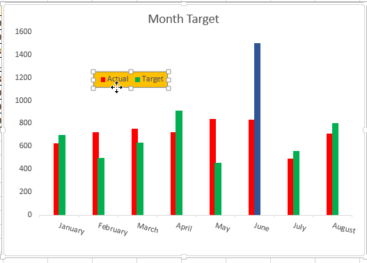
Trendline in Excel chart
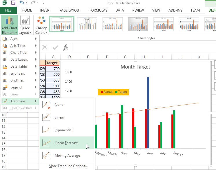
To show trendline in Excel chart, select 'DESIGN > Add Chart Element > Trendline > [appropriate options]'.
Select 'Linear Forecast' option as shown in the picture below.
and then select Timeline as displayed below.
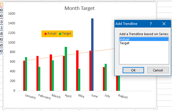
This will show 'Linear Forecast' trendline on the chart.
Quickies 
To delete a trendline or it's legend, select them by clicking and press 'Del' key from the keyboard.
Thanks for reading, hope this post has helped you to gain knowledge. If you liked this, please subscribe for further lessons and share to your friends and colleagues.
Views: 14135 | Post Order: 41


