 Online: 3630
Excel > Charts
Create a Chart in Excel
How to create a chart in Excel with example?
In the last post, we learnt ranking in MS Excel. In this post, we shall learn how to create a chart in MS Excel.
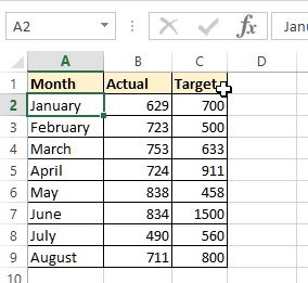
Before we proceed further let's have a sample data to draw a chart. Below are our chart data.
Create a chart
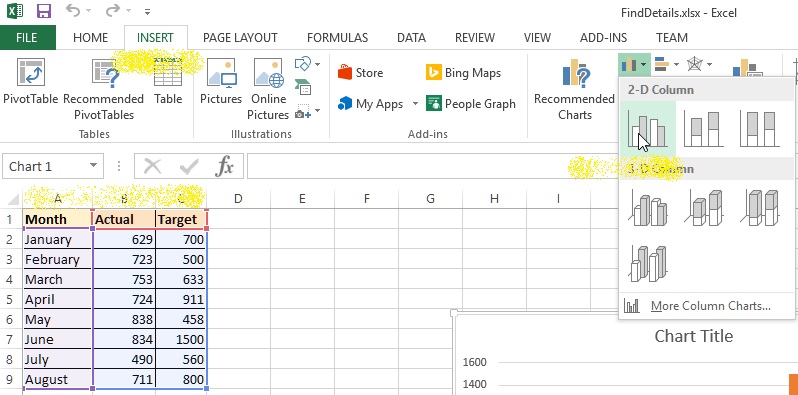
Now select all the data from A1 to C9, go to INSERT menu adn select 'Clustered Column' chart from Chart command on the ribbon as displayed in the picture below.
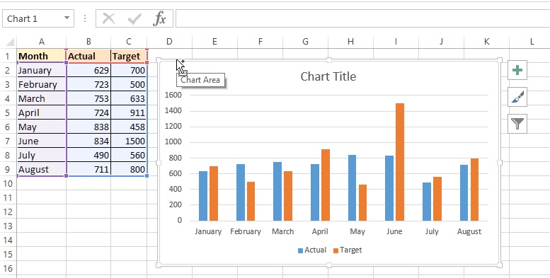
You will get a chart at the center of the sheet as shown below.
Move chart
To move the chart to different location, hold it from the outer border and drag.
Edit chart title
To edit the chart title, double click on the 'Chart Title' to bring in edit mode and then change the Title.
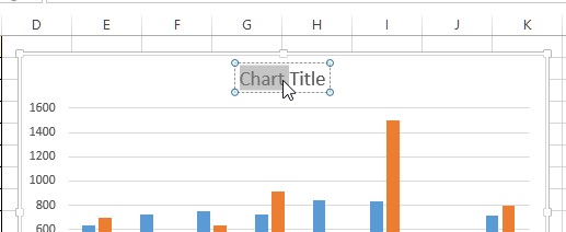
The modified title looks like this.
Change the background color of the chart
Solid color fill
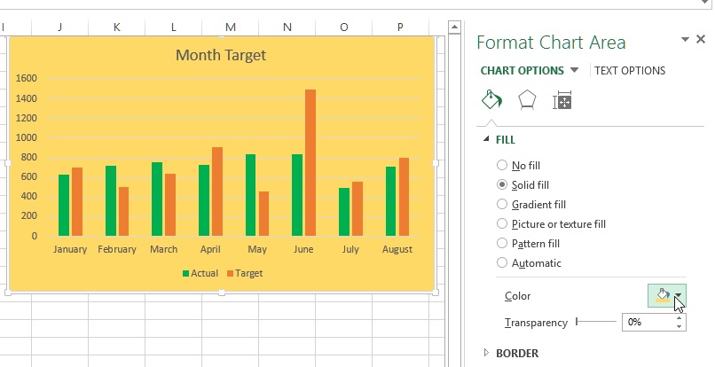
To change the background color of the chart, select the chart and choose Color dropdown from the 'Format Chart Area' at the right side.
To make the background semi-transparent, adjust the Transparency slider.
Gradient color fill
We can also have gradient background fill by selecting the 'Gradient fill' radio button and adjusting the 'Gradient stops' colors.
Picture fill
To fill the background with picture, select the 'Picture or texture fill' radio button and click on 'File...' button. Select the picture file and your picture should be in the background of the chart. You can set the transparency level as displayed in the picture below.
Change the legend area background
To change the chart legend area background, select the legend by clicking and select color as selected for background color above.
Changing the chart series/column color
To change the chart legend color, select the legend from the legend area by exactly clicking on the legend name and then select the color from the right side area as done above.
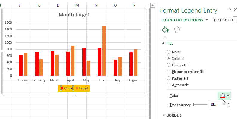
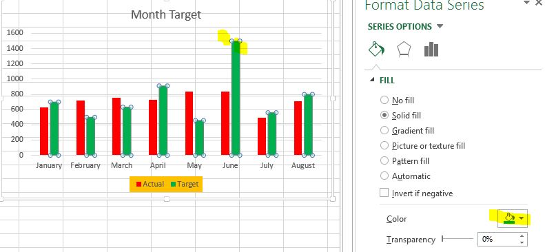
Alternatively, we can also click on the chart series/column of a specific data (Actual or Target) and select new color as shown in the picture below.
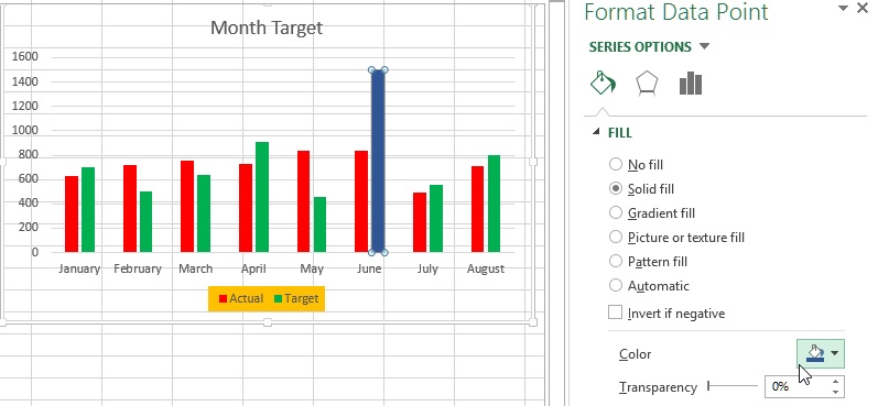
To change a single series/column color, just select that one by clicking and then clicking again (or double clicking) and select different color from the dropdown.
Resize the chart
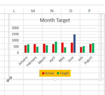
To resize the chart, hold the chart from any corner as displayed in the picture below and drag.
Resizing the charting area only
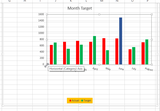
Sometimes you may not want to resize the whole chart but only the charting area when the data has been rendered in graphical format. To do that, click at the center of the chart till the charting area is selected. Now hold it from the corner and drag as displayed in the picture below.
Formatting chart axis Labels
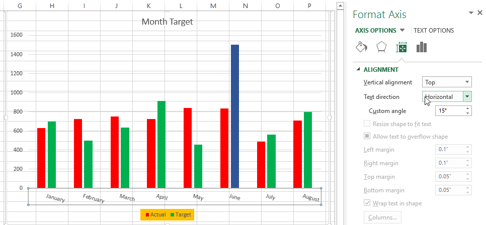
To format chart axis labels, select it by clicking the axis label area and format from the right side panel options.
Modifying Chart axis options and series spacing
Sometimes you may not be happy with chart series gap and you may want to modify, to do this select a series/column by clicking on them and click on 'Series Options' tab in the right panel and then change the slider values.
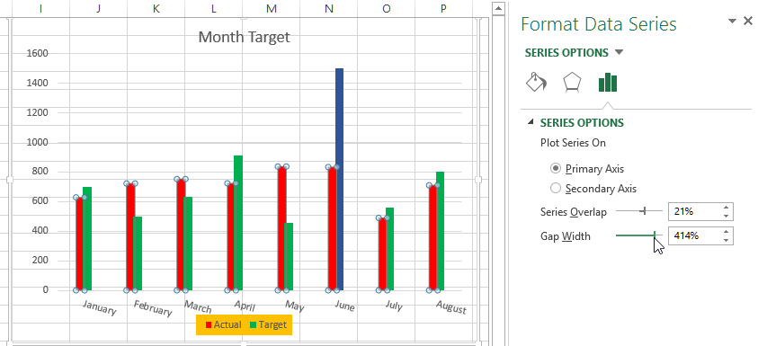
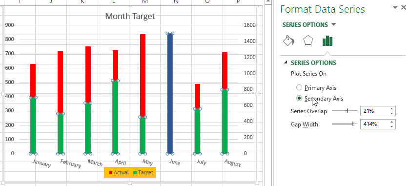
Chart secondary axis
To change the Excel chart to secondary axis, select the series and then go to 'Axis Options' and select 'Secondary Axis' radio button and your chart would change something like this.
Thanks for reading, hope this helps.
If you liked it do share with your friends and colleagues.
Views: 7487 | Post Order: 40


