Online: 3165


 Online: 3165
Buttons are the key in any web application to perform an action or to switch pages. There are some predefined buttons in Bootstrap that can be used in our applications.
  <div>
       <button type="button" class="btn btn-primary btn-lg">DotNetFunda</button>
  </div>
<div>
       <button type="button" class="btn btn-default">DotNetFunda</button>
       <button type="button" class="btn btn-primary">TechFunda</button>
       <button type="button" class="btn btn-info">ItFunda</button>
       <button type="button" class="btn btn-success">KidsFunda</button>
       <button type="button" class="btn btn-warning">FarmingFunda</button>
       <button type="button" class="btn btn-danger">FundooVideo</button>
       <button type="button" class="btn btn-link">SNarayan</button>
</div>
In the above code snippet we have defined how to use the different button styles. We have taken div as section and we are declaring buttons with following Bootstrap button class names
btn-default renders the button as default white colorbtn-primary renders it as light blue colorbtn-info renders it as skyblue colorbtn-success renders the button as green colorbtn-warning renders as orange colorbtn-dangerrenders as red colorbtn-link renders the button as hyperlinkoutput

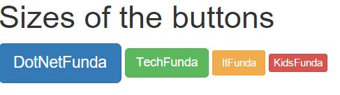
There are different sizes of the buttons they are
btn-lg - is used to produce the button as largesizebtn-md - is used to produce the button as medium sizebtn-sm - is use to produce the button as small sizebtn-xs - is used to produce the button size as extra small
<h1> Sizes of the buttons</h1>
    <div>
        <button type="button" class="btn btn-primary btn-lg">DotNetFunda</button>
        <button type="button" class="btn btn-success btn-md">TechFunda</button>
        <button type="button" class="btn btn-warning btn-sm">ItFunda</button>
        <button type="button" class="btn btn-danger btn-xs">KidsFunda</button>
    </div>
In the above code snippet we have defined the sizes of the buttons. We have taken div section and we are declaring buttons with following Bootstrap button class names as
btn-lg -renders the size of the button as large. btn-md- renders the size of the button as medium btn-sm- renders the size of the button as smallbtn-xs- renders the size of the button as extra smalloutput
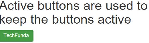
The .Active is used to appear the button pressed
<h1> Active buttons are used to keep the buttons active</h1>
    <div>
        <button type="button" class="btn btn-success active">TechFunda</button>
    </div>
In the above code snippet we are using button class active which is used to make the button as active.
output
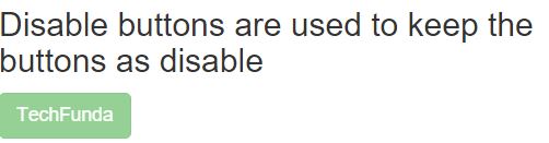
The disable button is used to disable the button
 <h3> Disable buttons are used to keep the buttons as disable</h3>
    <div>
        <button type="button" class="btn btn-success disabled">TechFunda</button>
    </div>
In the above code snippet we are using button class as disabled which is used to make the button disable.
output
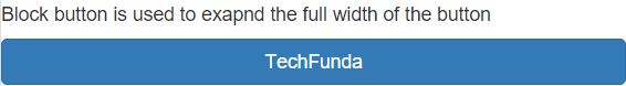
Block button is used to exapnd the full width of the button.
<h5>Block button is used to exapnd the full width of the button</h5>
    <div>
        <button type="button" class="btn btn-primary btn-block">TechFunda</button>
    </div>
btn-block is used to expand the width of the button.
output
There are different button tags
They are
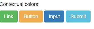
<h5>Contextual colors</h5>
    <div>
        <a class="btn btn-success" href="#" role="button">Link</a>
        <button class="btn btn-warning" type="submit">Button</button>
        <input class="btn btn-primary" type="button" value="Input">
        <input class="btn btn-info" type="submit" value="Submit">
    </div>
In the above code snippet we have taken div section , Tags as <input>, <link>, <button>,<submit> which are used as button tags.
output
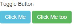
Toggle Button is used as when the active button is clicked it is used to toggle back the button or replace the button.
<h5>Toggle Button</h5>
    <div>
        <button type="button" class="btn btn-info" data-toggle="button">Click Me</button>
        <button type="button" class="btn btn-success" data-toggle="button">Click Me too</button>
    </div>
data-toggle is used to expand the width of the button
output
The button group is used to group the button.
<h5>Button group</h5>
    <div class="btn-group">
        <button type="button" class="btn btn-primary">DotNetFunda</button>
        <button type="button" class="btn btn-danger">TechFunda</button>
        <button type="button" class="btn btn-success">ItFunda</button>
        <button type="button" class="btn btn-info">KidsFunda</button>
    </div>
btn-group is used to grou the buttons
output

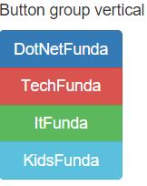
Button group vertical is used to group the buttons as vertical
 <h5>Button group vertical</h5>
    <div class="btn-group-vertical">
        <button type="button" class="btn btn-primary">DotNetFunda</button>
        <button type="button" class="btn btn-danger">TechFunda</button>
        <button type="button" class="btn btn-success">ItFunda</button>
        <button type="button" class="btn btn-info">KidsFunda</button>
    </div>
btn-group-vertical is used to group the buttons in vertical line.
output
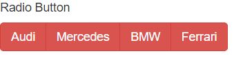
Radio button is used to select the single button among different buttons
 <h5>Radio Button</h5>
    <div class="btn-group" data-toggle="buttons">
        <span class="btn btn-danger">
            <input type="radio" name="options">Audi
        </span>
        <span class="btn btn-danger">
            <input type="radio" name="options">Mercedes
        </span>
        <span class="btn btn-danger">
            <input type="radio" name="options">BMW
        </span>
        <span class="btn btn-danger">
            <input type="radio" name="options">Ferrari
        </span>
    </div>
radio is used to select the single button.
output