Online: 4254


 Online: 4254
We can create vertical menu using scrollspy and affix in Bootstrap.
<style>
body {
position: relative;
}
.affix {
top: 20px;
}
div.col-sm-9 div {
height: 250px;
font-size: 28px;
}
#dnf {
color: white;
background-color: red;
}
#tec {
color: #fff;
background-color: #673ab7;
}
#child {
color: #fff;
background-color: #ff9800;
}
#on {
color: #fff;
background-color: #00bcd4;
}
#off{
color: #fff;
background-color: #009688;
}
@media screen and (max-width: 810px) {
#dnf, #tec, #child, #on, #off {
margin-left: 150px;
}
}
</style>
</head>
<body data-spy="scroll" data-target="#myScrollspy" data-offset="15">
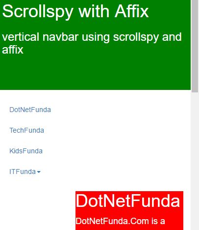
<div class="container-fluid" style="background-color:green;color:white;height:200px;">
<h1>Scrollspy with Affix</h1>
<h3>vertical navbar using scrollspy and affix </h3>
</div>
<br>
<div class="container">
<div class="row">
<nav class="col-sm-3" id="myScrollspy">
<ul class="nav nav-pills nav-stacked" data-spy="affix" data-offset-top="205">
<li><a href="#dnf">DotNetFunda</a></li>
<li><a href="#tec">TechFunda</a></li>
<li><a href="#child">KidsFunda</a></li>
<li class="dropdown">
<a class="dropdown-toggle" data-toggle="dropdown" href="#">ITFunda<span class="caret"></span></a>
<ul class="dropdown-menu">
<li><a href="#on">Online training</a></li>
<li><a href="#off">Offline training</a></li>
</ul>
</li>
</ul>
</nav>
<div class="col-sm-9">
<div id="dnf">
<h1>DotNetFunda</h1>
<p>DotNetFunda.Com is a popular online tutorials, we hope you will soon become one of the 'Most Valuable' professional and start shining in your career.</p>
</div>
<div id="tec">
<h1>TechFunda</h1>
<p>TechFunda is a free How to web technologies tutorials website. Enjoy your learning in How to manner that are based on real time problem solutions. If you have a how to problem to ask, please ask here</p>
</div>
<div id="child">
<h1>KidsFunda</h1>
<p>KidsFunda is a online website for entertainment , watching videos , playing games, paintings etc</p>
</div>
<div id="on">
<h1>Online training</h1>
<p>ITFunda provides online training</p>
</div>
<div id="off">
<h1>Offline training</h1>
<p>ITFunda provides offline training</p>
</div>
</div>
</div>
</div>
</body>
scrollspy, data-target as #myscrollspy, data-offset value as 15container-fluid and we have given style to define the style to the div elementcontainer and we have div with class value row , we have nav element with class value as col-sm-3 with id as mynavbar which calls the scroll function of the body element<ul> element to define the list values using class value nav navbar- nav nav-stacked and defined the list values with id and we created dropdown for the list value ITFunda using anchor tag using class value dropdown-toggle col-sm-9 and created the div element with the id of list value to define the description of the list valuecolor and background-color output
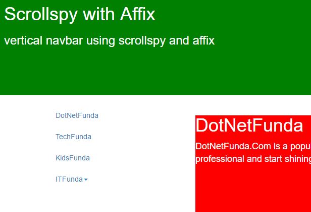
When we minimize the screen output appears as