Online: 20223


 Online: 20223
Button are actions performed to function as clickable functions
<style>
.button {
background-color: pink;
border: none;
color: white;
padding: 15px 32px;
text-align: left;
font-size: 20px;
margin: 4px 2px;
cursor: progress;
}
</style>
</head>
<body>
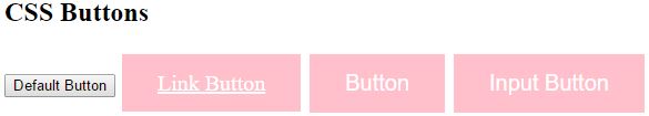
<h2>CSS Buttons</h2>
<button>Default Button</button>
<a href="#" class="button">Link Button</a>
<button class="button">Button</button>
<input type="button" class="button" value="Input Button">
</body>
In the above code snippet we have buttons with styles as default button, link , buttontype, and button
output
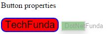
Different types of Button styles are
<style>
        .button {
           background-color:red;
           font-size:20px;
           border-radius:10px;
           border:2px solid blue;
        }
        .button1{
          box-shadow: 0 8px 16px 0 rgba(0,0,0,0.2), 0 6px 20px 0 rgba(0,0,0,0.19);
          cursor:not-allowed;
          opacity:0.4;
          background-color:green;
          width:50px;
        }
    </style>
</head>
<body>
    <button class="button">TechFunda</button>
    <button class="button1">DotNetFunda</button>
</body>
In the above code snippet we have defined button properties are background color, fontsize, border radius, border, boxshadow, cursor, opacity, width by giving two button classes
output
We can create buttons as group by using float:left; property
<style>
        .button {
            background-color: red;
            border: 2px solid grey;
            color: white;
            padding: 15px 32px;
            text-align: center;
            text-decoration: none;
            display: inline;
            font-size: 20px;
            cursor: pointer;
            float: left;
        }
            .button:hover {
                background-color: green;
            }
    </style>
</head>
<body>
    <h2>Button Groups</h2>
    <p>Remove margins and float the buttons to create a button group:</p>
    <button class="button">DotNetFunda</button>
    <button class="button">TechFunda</button>
    <button class="button">ITFunda</button>
</body>
In the above code snippet we have float:left property to create button group
output

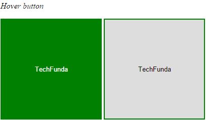
It creates hover when the hover is placed it changes the background color
<style>
        .button {
            border: 2px solid green;
            height: 200px;
            width: 200px;
        }

            .button:hover {
                background-color: green;
                color: white;
            }
    </style>
</head>
<body>
    <button class="button">TechFunda</button>
    <button class="button">TechFunda</button>
</body>
In the above code snippet we have defined hover, we have button with height, width and border and button Hover with background color and color as white It changes the background color as gren when the mouse is placed on the button
output
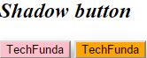
It creates shadow when it places hover
 <style>
       .button1 {
    box-shadow: 0 8px 16px 0 rgba(0,0,0,0.2), 0 6px 20px 0 rgba(0,0,0,0.19);
    background-color:pink;
}

.button2:hover {
    box-shadow: 0 12px 16px 0 rgba(0,0,0,0.24),0 17px 50px 0 rgba(0,0,0,0.19);
    background-color:orange;
}
    </style>
</head>
<body>
    <p><i><h2>Shadow button</h2></i></p>
    <button class="button1">TechFunda</button>
    <button class="button2">TechFunda</button>
</body>
In the above code snippet we have defined the shadow button we created button with shadow effects and another button with hover with shadow effects to create shadow when the hover is placed on the hover button
output