Online: 540


 Online: 540
Tooltip is a message which appears when a cursor is positioned over an icon, image, hyperlink, or other element in a graphical user interface.
<style>
.tooltip {
position: relative;
display: inline-block;
border-bottom: 2px solid green;
}
.tooltip .tooltiptext {
visibility: hidden;
width: 200px;
background-color: black;
color: yellow;
text-align: center;
border-radius: 20px;
padding: 5px 0;
position:fixed;
z-index: 1;
}
.tooltip:hover .tooltiptext {
visibility: visible;
}
</style>
</head>
<body style="text-align:center;">
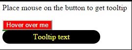
<p>Place mouse on the button to get tooltip</p>
<div class="tooltip"><button type="button" style="background-color:red;color:white;">Hover over me</button>
<span class="tooltiptext">Tooltip text</span>
</div>
</body>
In the above code snippet we have the tooltip which appears as the when the mouse is placed on the button it displays the tooltip message, we have tooltip with properties to define the border, etc and tooltip text to define color, background color, etc with different properties, tooltip hover is uses a properties visibility as visible to show the tooltip when the mouse is placed on the button
output
Right tooltip is used to display the tooltip right side
<style>
.tooltip {
position: relative;
display: inline-block;
border-bottom: 2px solid black;
}
.tooltip .tooltiptext {
visibility: hidden;
width: 120px;
background-color: silver;
color: black;
text-align: center;
border-radius: 10px;
padding: 5px 0;
position: absolute;
z-index: 1;
top: -5px;
left: 100%;
}
.tooltip:hover .tooltiptext {
visibility: visible;
}
</style>
</head>
<body>
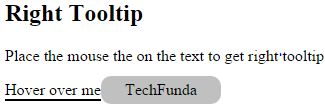
<h2>Right Tooltip</h2>
<p>Place the mouse the on the text to get right tooltip</p>
<div class="tooltip">
Hover over me
<span class="tooltiptext">TechFunda</span>
</div>
</body>
In the above code snippet we have defined right tooltip, in order to get the right tooltip we need to add top and left properties
output
It creates the tool tip on the left side
<style>
.tooltip {
position: relative;
display: inline-block;
border-bottom: 1px solid black;
}
.tooltip .tooltiptext {
visibility: hidden;
width: 120px;
background-color: orange;
color: yellow;
text-align: center;
border-radius: 20px;
padding: 10px 10px;
position: absolute;
z-index: 1;
top: -5px;
right: 105%;
}
.tooltip:hover .tooltiptext {
visibility: visible;
}
</style>
</head>
<body style="text-align:right;">
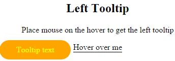
<h2>Left Tooltip</h2>
<p>Place mouse on the hover to get the left tooltip</p>
<div class="tooltip">
Hover over me
<span class="tooltiptext">Tooltip text</span>
</div>
</body>
In the above code snippet we have defined the left tooltip, we use the property top and right to define the left tooltip with given values
output
To get the top tooltip we need to add bottom and margin left property
<style>
.tooltip {
position: relative;
display: inline-block;
border-bottom: 1px dotted black;
}
.tooltip .tooltiptext {
visibility: hidden;
width: 120px;
background-color: green;
color: black;
text-align: center;
border-radius: 10px;
position: absolute;
z-index: 1;
bottom: 100%;
left: 50%;
margin-left: -60px;
}
.tooltip:hover .tooltiptext {
visibility: visible;
}
</style>
</head>
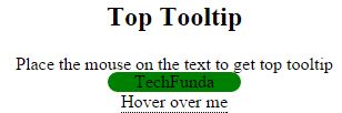
<body style="text-align:center;">
<h2>Top Tooltip</h2>
<p>Place the mouse on the text to get top tooltip</p>
<div class="tooltip">
Hover over me
<span class="tooltiptext">TechFunda</span>
</div>
</body>
In the above code snippet we have defined the top tooltip, in order to add the top tooltip we need to add the bottom and margin left properties to get top tooltip
output
It aligns the tooltip in the bottom by using the properties of top
<style>
.tooltip {
position: relative;
display: inline-block;
border-bottom: 1px dotted black;
}
.tooltip .tooltiptext {
visibility: hidden;
width: 120px;
background-color: bisque;
color: blue ;
text-align: center;
border-radius: 6px;
padding: 5px 0;
position: absolute;
z-index: 1;
top: 100%;
left: 50%;
margin-left: -60px;
}
.tooltip:hover .tooltiptext {
visibility: visible;
}
</style>
</head>
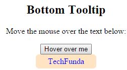
<body style="text-align:center;">
<h2>Bottom Tooltip</h2>
<p>Move the mouse over the text below:</p>
<div class="tooltip">
<button type="button">Hover over me</button>
<span class="tooltiptext">TechFunda</span>
</div>
</body>
In the above code snippet we have tooltip bottom, in order to get the bottpom tool tip we ,need to add top and margin left property
output
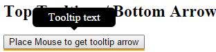
To add the tooltip arrows we need to add empty after tooltip
To add the bottom arrows we need to add the top and empty in the content property in the after property
<style>
    .tooltip {
        position: relative;
        display: inline-block;
        border-bottom: 2px solid orange;
    }

        .tooltip .tooltiptext {
            visibility: hidden;
            width: 120px;
            background-color: black;
            color: #fff;
            text-align: center;
            border-radius: 6px;
            padding: 5px 0;
            position: absolute;
            z-index: 1;
            bottom: 150%;
            left: 50%;
            margin-left: -60px;
        }

            .tooltip .tooltiptext::after {
                content: "";
                position: absolute;
                top: 100%;
                left: 50%;
                margin-left: -5px;
                border-width: 5px;
                border-style: solid;
                border-color: black transparent transparent transparent;
            }

        .tooltip:hover .tooltiptext {
            visibility: visible;
        }
</style>
    </head>
<body>
    <h2>Top Tooltip w/ Bottom Arrow</h2>
    <div class="tooltip">
        <button type="button">Place Mouse to get tooltip arrow</button>
        <span class="tooltiptext">Tooltip text</span>
    </div>
</body>
In the above code snippet we have the bottom arrow, to create the bottom arrow we need to add top, content as empty in the after selector
output
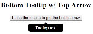
We need to add the bottom property to add top arrow tooltip
<style>
    .tooltip {
        position: relative;
        display: inline-block;
        border-bottom: 1px dotted black;
    }

        .tooltip .tooltiptext {
            visibility: hidden;
            width: 120px;
            background-color: black;
            color: #fff;
            text-align: center;
            border-radius: 6px;
            padding: 5px 0;
            position: absolute;
            z-index: 1;
            top: 150%;
            left: 50%;
            margin-left: -60px;
        }

            .tooltip .tooltiptext::after {
                content: "";
                position: absolute;
                bottom: 100%;
                left: 50%;
                margin-left: -5px;
                border-width: 5px;
                border-style: solid;
                border-color: transparent transparent black transparent;
            }

        .tooltip:hover .tooltiptext {
            visibility: visible;
        }
</style>
<body style="text-align:center;">

    <h2>Bottom Tooltip w/ Top Arrow</h2>
    <div class="tooltip">
        <button type="button">Place the mouse to get the tooltip arrow</button>
        <span class="tooltiptext">Tooltip text</span>
    </div>
</body>
In the above code snippet we have the top tooltip arrow, we need to add the bottom and content as empty property to create top tooltip arrow
output
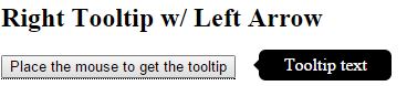
It creates the tooltip in the right side by showing the arrow left side
  <style>
        .tooltip {
            position: relative;
            display: inline-block;
            border-bottom: 1px dotted black;
        }

            .tooltip .tooltiptext {
                visibility: hidden;
                width: 120px;
                background-color: black;
                color: #fff;
                text-align: center;
                border-radius: 6px;
                padding: 5px 0;
                position: absolute;
                z-index: 1;
                top: -5px;
                left: 110%;
            }

                .tooltip .tooltiptext::after {
                    content: "";
                    position: absolute;
                    top: 50%;
                    right: 100%;
                    margin-top: -5px;
                    border-width: 5px;
                    border-style: solid;
                    border-color: transparent black transparent transparent;
                }

            .tooltip:hover .tooltiptext {
                visibility: visible;
            }
    </style>
</head>
<body>
In the above code snippet we have created left arrow tooltip, by using the property right and content as empty in the the after selector
output
It creates the tooltip to right by using left property
<style>
.tooltip {
position: relative;
display: inline-block;
border-bottom: 1px dotted black;
}
.tooltip .tooltiptext {
visibility: hidden;
width: 120px;
background-color: red;
color: pink;
text-align: center;
border-radius: 6px;
padding: 5px 0;
position: absolute;
z-index: 1;
top: -5px;
right: 110%;
}
.tooltip .tooltiptext::after {
content: "";
position: absolute;
top: 50%;
left: 100%;
margin-top: -5px;
border-width: 5px;
border-style: solid;
border-color: transparent transparent transparent black;
}
.tooltip:hover .tooltiptext {
visibility: visible;
}
</style>
</head>
<body style="text-align:center;">
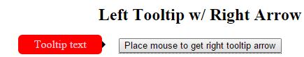
<h2>Left Tooltip w/ Right Arrow</h2>
<div class="tooltip">
<button type="button">Place mouse to get right tooltip arrow</button>
<span class="tooltiptext">Tooltip text</span>
</div>
</body>
In the above code snippet we have the right arrow tooltip by using the property left and content as empty in the after selector
output