Online: 4845


 Online: 4845
A set of buttons or images in a row or column that serves as a control point to link the user to sections on a Web site. The navigation bar may also be a single graphic image with multiple selections, Navigation bar is very usefull to devolop the website .
A navigation bar needs basics of html, in order to create navigation bar we need to create the list of links
 <p><i>Links with list</i></p>
        <ul>
            <li><a href="http://www.dotnetfunda.com">DotnetFunda</a></li>
            <li><a href="http://www.techfunda.com">TechFunda</a></li>
            <li><a href="http://www.itfunda.com">ITFunda</a></li>
        </ul>
In the above code snippet we have the link with list We have created the link in the <ul>element to create the list to the link, the anchor tag <a> is inserted in the <li> tag to create the list to the link
output

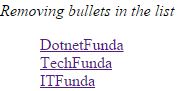
To create the navigation bar we need not to have the bullets in the list, we need to add the style as list style:none to remove the bullets in the list
 <style>
        li{
            list-style:none;
        }
    </style>
</head>
<body>
    <p><i>Removing bullets in the list</i></p>
        <ul>
            <li><a href="http://www.dotnetfunda.com">DotnetFunda</a></li>
            <li><a href="http://www.techfunda.com">TechFunda</a></li>
            <li><a href="http://www.itfunda.com">ITFunda</a></li>
        </ul>
</body>
In the above code snippet we removed bullets from list, we added list style as none to remove bullets in the list, the link <a> tag is given in the <li>element.
output
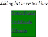
To arrange the list in the vertical we need to add a element in list<li>
<style>
        ul{
            list-style:none;
        }
        li a{
            display:block;
            width:85px;
            height:30px;
            background-color:green;
        }
    </style>
</head>
<body>
    <p><i>Adding list in vertical line</i></p>
        <ul>
            <li><a href="http://www.dotnetfunda.com">DotnetFunda</a></li>
            <li><a href="http://www.techfunda.com">TechFunda</a></li>
            <li><a href="http://www.itfunda.com">ITFunda</a></li>
        </ul>
</body>
In the above code snippet we have defined adding list in vertical line, to create the list in vertical shape we need to add the <a> tag in the list
display:block; - It adds the whole link as clickable
width - It adds width size of the block
output
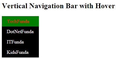
Hover is added to the vertical navigation bar, when the mouse is placed on the link it changes the background color of the link
 <style>
        ul {
            list-style-type: none;
            margin:0;
            padding:0;
            width: 120px;
            background-color: black;
        }
        li a {
            display: block;
            color: white;
            padding: 8px 0px 8px 16px;
            text-decoration: none;
        }
               li a:hover {
                background-color: green;
                color: red;
            }
    </style>
</head>
<body>
    <h2>Vertical Navigation Bar with Hover</h2>
    <ul>
        <li><a href="http:www.techfunda.com">TechFunda</a></li>
        <li><a href="http://www.dotnetfunda.com">DotNetFunda</a></li>
        <li><a href="http://www.itfunda.com">ITFunda</a></li>
        <li><a href="http://www.kidsfunda.com">KidsFunda</a></li>
    </ul>
</body>
Vertical navigation with Hover
In the above code snippet we have vertical navigation bar with Hover, we added the hover element a:hover properties as color red and background color as green, when the hover is placed on the link it changes the color and backgroundcolor of the link.
output
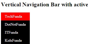
Active is added to the link to get the link in active state
 <style>
        ul {
            list-style-type: none;
            margin:0;
            padding:0;
            width: 120px;
            background-color: black;
        }
        li a {
            display: block;
            color: white;
            padding: 8px 0px 8px 16px;
            text-decoration: none;
        }
            li a:hover {
                background-color: green;
                color: red;
            }
            .active{
                color:black;
                background-color:red
            }
    </style>
</head>
<body>
    <h2>Vertical Navigation Bar with active</h2>
    <ul>
        <li class="active"><a href="http:www.techfunda.com">TechFunda</a></li>
        <li><a href="http://www.dotnetfunda.com">DotNetFunda</a></li>
        <li><a href="http://www.itfunda.com">ITFunda</a></li>
        <li><a href="http://www.kidsfunda.com">KidsFunda</a></li>
    </ul>
</body>
vertical navigation bar in active state
In the above code snippet we have the vertical navigation bar to add the link as active state and the link active is added to the <li> element
output
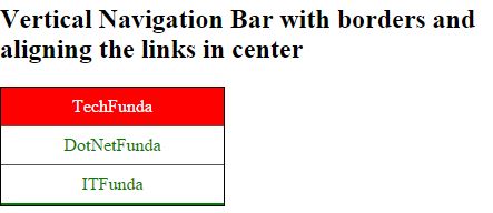
Navigation bar with center and border
In order to align the navigation bar in center, we need to add the textalign property and border to the <li> element
 <style>
        ul {
            list-style-type: none;
            margin: 0;
            padding: 0;
            width: 200px;
            background-color: white;
            border: 1px solid black;
        }
        li a {
            display: block;
            color: green;
            padding: 8px 16px;
            text-decoration: none;
        }
        li {
            text-align: center;
            border-bottom: 1px solid #555;
        }
            li:last-child {
                border-bottom: 2px solid green;
            }
            li a.active{
                background-color: red;
                color: white;
            }
            li a:hover:not(.active) {
                background-color: pink;
                color: white;
            }
    </style>
</head>
<body>
    <h2>Vertical Navigation Bar with borders and aligning the links in center</h2>
    <ul>
        <li><a class="active" href="http://www.techfunda.com">TechFunda</a></li>
        <li><a href="http://www.dotnetfunda.com">DotNetFunda</a></li>
        <li><a href="http://www.itfunda.com">ITFunda</a></li>
    </ul>
</body>
In the above code snippet we have the text align property and border to align the text to the center and applying border to the list
output
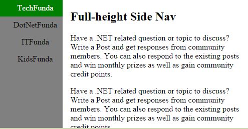
It creates the full height side navigation
 <style>
        body {
            margin: 0;
        }
        ul {
            list-style-type: none;
            margin: 0;
            padding: 0;
            width: 25%;
            background-color: #808080;
            position: fixed;
            height: 100%;
            overflow: auto;
        }
        li a {
            display: block;
            color: black;
            padding: 8px 0 8px 16px;
            text-decoration: none;
            text-align:center;
        }
            li a.active {
                background-color: green;
                color: white;
            }

            li a:hover:not(.active) {
                background-color: red;
                color: white;
                text-align:left;
            }
    </style>
</head>
<body>
    <ul>
        <li><a class="active" href="#home">TechFunda</a></li>
        <li><a href="#news">DotNetFunda</a></li>
        <li><a href="#contact">ITFunda</a></li>
        <li><a href="#about">KidsFunda</a></li>
    </ul>

    <div style="margin-left:25%;padding:1px 16px;height:1000px;">
        <h2>Full-height Side Nav</h2>
        <p> Have a .NET related question or topic to discuss? Write a Post and get responses from community members. You can also respond to the existing posts and win monthly prizes as well as gain community credit points.
</p>
        <p> Have a .NET related question or topic to discuss? Write a Post and get responses from community members. You can also respond to the existing posts and win monthly prizes as well as gain community credit points.
</p>
        <p>
            Have a .NET related question or topic to discuss? Write a Post and get responses from community members. You can also respond to the existing posts and win monthly prizes as well as gain community credit points.

        </p>
<p> Have a .NET related question or topic to discuss? Write a Post and get responses from community members. You can also respond to the existing posts and win monthly prizes as well as gain community credit points.
</p>
    </div>
</body>
Fullheight side navigation bar
In the above code snippet we have created the side page with full height navigation bar beside the given navigation bar, we have the navigation bar width as 25%, we created the side page with the div element by giving the style as width with margin-left which starts the page from the side of the navigation bar
output
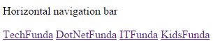
It is used to create the links in horizontal manner
 <style>
                ul {
                    list-style-type: none;
                    margin: 0;
                    padding: 0;
                }

                li {
                    display: inline;
                }
            </style>
        </head>
        <body>
            <p>Horizontal navigation bar</p>
            <ul>
                <li><a href="#home">TechFunda</a></li>
                <li><a href="#news">DotNetFunda</a></li>
                <li><a href="#contact">ITFunda</a></li>
                <li><a href="#about">KidsFunda</a></li>
            </ul>
        </body>
In the above code snippet we have created horizontal navigation bar by using display:inline; we can create the links in the horizontal navigation bar
output
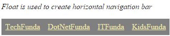
To create the horizontal lists we have another method by using float in <li> element
<style>
        ul {
            list-style-type: none;
            margin: 0;
            padding: 0;
            overflow: hidden;
        }

        li {
            float: left;
        }

            li a {
                display: block;
                padding: 8px;
                background-color: #808080;
                color:palegoldenrod;
            }
    </style>
</head>
<body>
    <p><i>Float is used to create horizontal navigation bar</i></p>
    <ul>
        <li><a href="#techfunda">TechFunda</a></li>
        <li><a href="#DotNetFunda">DotNetFunda</a></li>
        <li><a href="#ITFunda">ITFunda</a></li>
        <li><a href="#KidsFunda">KidsFunda</a></li>
    </ul>
</body>
In the above code snippet we have created the horizontal navigation bar, w can create the horizontal navigation bar by using float:left which creates the navigation bar in horizontal
output
It creates the list with background color by using background color in the ul
 <style>
        ul {
            list-style-type: none;
            margin: 0;
            padding: 0;
            overflow: hidden;
            background-color: black;

        }

        li {
            float: left;
        }

            li a {
                display: block;
                padding: 8px;
                color:green
            }
    </style>
</head>
<body>
    <p><i>Float with background color</i></p>
    <ul>
        <li><a href="#techfunda">TechFunda</a></li>
        <li><a href="#dotnetfunda">KidsFunda</a></li>
        <li><a href="#itfunda">ITFunda</a></li>
        <li><a href="#farmingfunda">DotNetFunda</a></li>
    </ul>
</body>
In the above code snippet we have created the navigation bar with background color by using background color in the ulelement
output

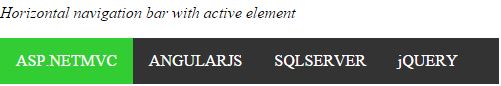
In this we are creating the horizontal navigation bar with active links
 <style>
        ul {
            list-style-type: none;
            margin: 0;
            padding: 0;
            overflow: hidden;
            background-color: #333;
        }

        li {
            float: left;
        }
            li a {
                display: block;
                color: white;
                text-align: center;
                padding: 14px 16px;
                text-decoration: none;
            }
                li a:hover {
                    background-color: green;
                }
                .active{ background-color:limegreen;
                }
    </style>
</head>
<body>
    <p><i>Horizontal navigation bar with active element</i></p>
    <ul>
        <li class="active"><a class="active" href="#home">ASP.NETMVC</a></li>
        <li><a href="#news">ANGULARJS</a></li>
        <li><a href="#contact">SQLSERVER</a></li>
        <li><a href="#about">jQUERY</a></li>
    </ul>
</body>
Navigation bar with active element
In the above code snippet we have created the navigation bar with active element by using class as active
output
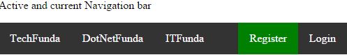
Active and current navigation bar defines the link will be in active state and current state
 <style>
        ul {
            list-style-type: none;
            margin: 0;
            padding: 0;
            overflow: hidden;
            background-color: #333;
        }

        li {
            float: left;
        }
            li a {
                display: block;
                color: white;
                text-align: center;
                padding: 14px 16px;
                text-decoration: none;
            }
                li a:hover:not(.active) {
                    background-color:red;
                }

        .active {
            background-color: green;
        }
    </style>
</head>
<body>
    <p>Active and current Navigation bar</p>
    <ul>
        <li><a href="#home">TechFunda</a></li>
        <li><a href="#news">DotNetFunda</a></li>
        <li><a href="#contact">ITFunda</a></li>
        <ul style="float:right;list-style-type:none;">
            <li><a class="active" href="#about">Register</a></li>
            <li><a href="#login">Login</a></li>
        </ul>
    </ul>
</body>
Active and current navigation bar
In the above code snippet we have created the active and current navigation bar by using active element in the list
output
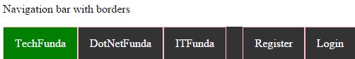
We can create navigation bar withe borders by using Border property
 <style>
        ul {
            list-style-type: none;
            margin: 0;
            padding: 0;
            overflow: hidden;
            background-color: #333;
        }

        li {
            float: left;
            border:1px solid pink;
        }
            li a {
                display: block;
                color: white;
                text-align: center;
                padding: 14px 16px;
                text-decoration: none;
            }
                li a:hover:not(.active) {
                    background-color:red;
                }

        .active {
            background-color: green;
        }
    </style>
</head>
<body>
    <p>Navigation bar with borders</p>
    <ul>
        <li><a class="active" href="#techfunda">TechFunda</a></li>
        <li><a href="#DotNetFunda">DotNetFunda</a></li>
        <li><a href="#ITFunda">ITFunda</a></li>
        <ul style="float:right;list-style-type:none;">
            <li><a href="#FarmingFunda">Register</a></li>
            <li><a href="#login">Login</a></li>
        </ul>
    </ul>
</body>
In the above code snippet we have the navigation with border, we use the border property to create the borders in the list
output
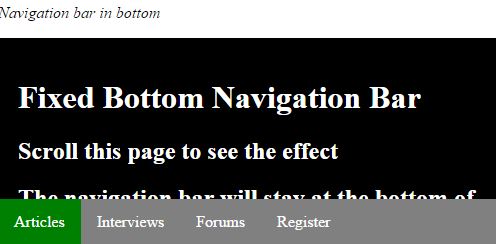
We can create the navigation bar in the bottom by using the bottom property
 <style>
        body {
            margin: 0;
        }

        ul {
            list-style-type: none;
            margin: 0;
            padding: 0;
            overflow: hidden;
            background-color: #808080;
            position: fixed;
            bottom: 0;
            width: 100%;
        }

        li {
            float: left;
        }

            li a {
                display: block;
                color: white;
                text-align: center;
                padding: 14px 16px;
                text-decoration: none;
            }

                li a:hover:not(.active) {
                    background-color:black;
                }

        .active {
            background-color: green;
        }
    </style>
</head>
<body>
    <p><i>Navigation bar in bottom</i></p>
    <ul>
        <li><a class="active" href="#home">Articles</a></li>
        <li><a href="#news">Interviews</a></li>
        <li><a href="#contact">Forums</a></li>
        <li><a href="#about">Register</a></li>
    </ul>
    <div style="padding:20px;background-color:black;height:1500px;color:white">
        <h1>Fixed Bottom Navigation Bar</h1>
        <h2>Scroll this page to see the effect</h2>
        <h2>The navigation bar will stay at the bottom of the page while scrolling</h2>
        <p> Have a .NET related question or topic to discuss? Write a Post and get responses from community members. You can also respond to the existing posts and win monthly prizes as well as gain community credit points.</p>
        <p>Have a .NET related question or topic to discuss? Write a Post and get responses from community members. You can also respond to the existing posts and win monthly prizes as well as gain community credit points.</p>
        <p>Have a .NET related question or topic to discuss? Write a Post and get responses from community members. You can also respond to the existing posts and win monthly prizes as well as gain community credit points.</p>
        <p>Have a .NET related question or topic to discuss? Write a Post and get responses from community members. You can also respond to the existing posts and win monthly prizes as well as gain community credit points.</p>
    </div>

</body>
In the above code snippet we have the navigation bar with the bottom property, we used the bottom property, we have vused the bottom as 0 which applies the given link to be in the bottom and the text is on the top of the page
output