Online: 3531


 Online: 3531
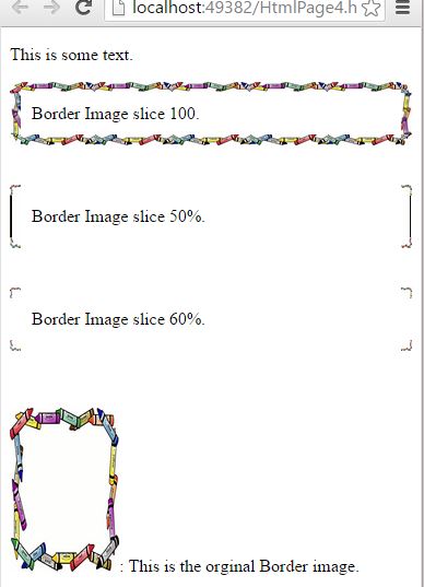
By using border-image-slice property we can slice the border image. We can slice the border-image into 9 groups (4corners, 4 edges, middle). The border-image-slice property decides the placement of border-image as per the given property value.
<style>
        #divImgR {
            border: 12px solid transparent;
            padding: 12px;
            border-image-source: url(microsoft-word-clip-art-borders-2571.jpg);
            border-image-repeat: repeat;
            border-image-slice: 100;
        }

        #divImgS {
            border: 20px solid transparent;
            padding: 20px;
            border-image-source: url(microsoft-word-clip-art-borders-2571.jpg);
            border-image-repeat: repeat;
            border-image-slice: 50%;
        }

        #divImgT {
            border: 10px solid transparent;
            padding: 10px;
            border-image-source: url(microsoft-word-clip-art-borders-2571.jpg);
            border-image-repeat: repeat;
            border-image-slice: 60%;
        }
</style>

<body>
    <p>This is some text.</p>
    <div id="divImgR">
        Border Image slice 100.
    </div>
    <br />
    <br />
    <div id="divImgS">
        Border Image slice 50%.
    </div>
    <br />
    <br />
    <div id="divImgT">
        Border Image slice 60%.
    </div>
    <br />
    <br />
    <p>
        <img src="microsoft-word-clip-art-borders-2571.jpg" width="100" height="150"/>: This is the orginal Border image.</p>
</body>
In the above code snippet we have given border-image-slice property to the ID selector. So that the ID selector applies theborder-image-slice property to the <div> elements.
OUTPUT