Online: 9237


 Online: 9237
Responsive web design is not a program or coding, it is an responsibility while creating a good looking web pages, those web pages can be viewed by using many different devices like desktops, tablets, phones,...etc. Responsive web design uses only HTML and CSS.
The main aim of Responsive web design is the web page should be good and should work finely in all the devices with out leaving any information even if the page viewed in different devices.
DESKTOP

TABLET

MOBILE
Same web page opened in the above all three devices, as the size of the device changes the layout of the web page changes, but the content remains same.
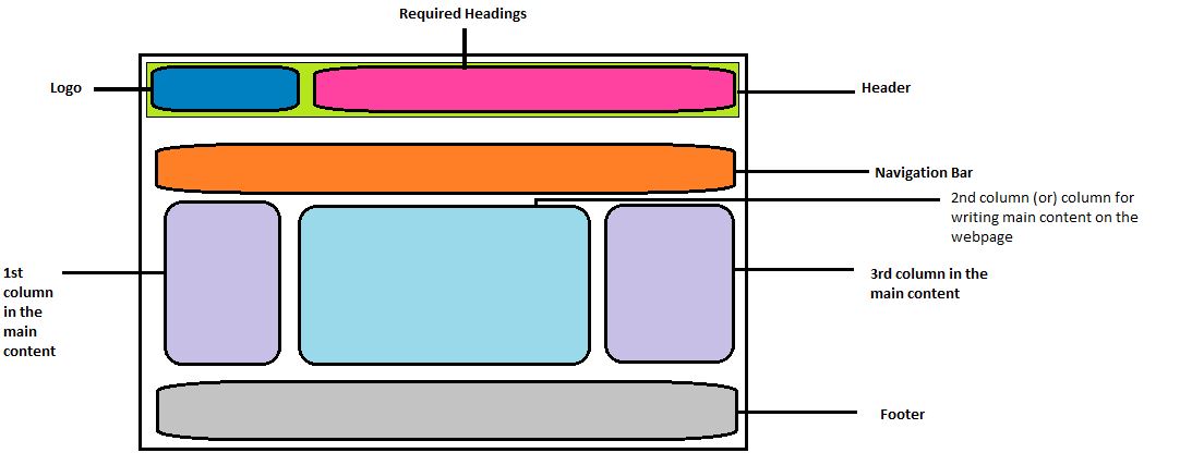
NOTE: The best layout for creating a webpage is the page with one header with the logo and headings, one navigation bar, one footer and the main content with three coloumns.