 Online: 2265
Excel > Charts
Chart style, filters and elements in Excel
How to style, filter data and customize elements on the charts in MS Excel?
In the previous post, we learnt about Secondary axis chart in Excel. In this post, we shall learn styling and changing color scheme of chart and filtering data points and names on chart.
Chart Styles
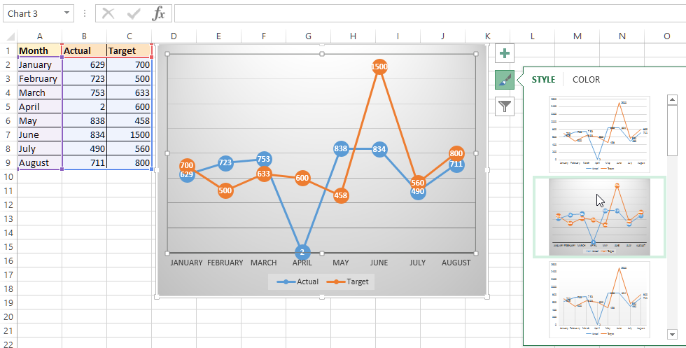
The easiest way to style and change color scheme of the chart is to use the shortcut command button that appears when we select the chart. Look at the top-right side of the chart below. As and when you move through different chart styles, your chart is shown in that style in real time.
Depending on which style you liked, just click on that one and you will get your final chart converted into that style as shown below.
To change the color schem, select the other tab on the 'Chart Type' dialog box and select through differnt color schemes as shown below.
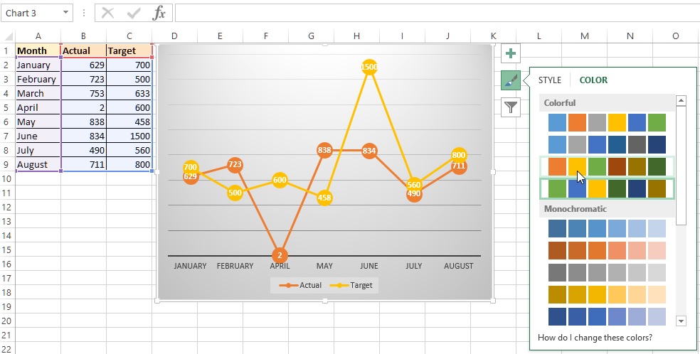
Chart Filters
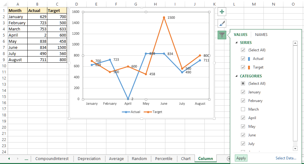
Notice the below chart, there is no data point for March month, this is because we have filtered March month data from 'Chart Filters' dialog box.
This is little different from above one (Chart style), here after selection of the filter we need to click on 'Apply' button at the left-bottom of the dialog box to affect the selection on the chart.
As we have unchecked the March month check box, so the March month data point is not appearing.
Similarly, to control the axis names go to the 'Names' tab of the dialog box and select 'Series' or 'Categories'. In this case, we have selected 'Series' as 'None' so instead of Series name coming as 'Actual' and 'Target', it's coming as 'Series1' and 'Series2' on the chart.
Do not forget to click on 'Apply' button after selection.
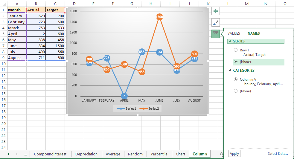
Chart Elements
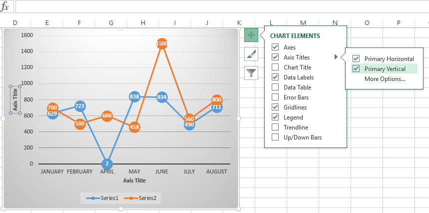
To customize the chart elements on the Chart, select the 1st shortcut command button as shown below and then go for respective items and their drill down menus.
In below example, we have selected 'Axis Titles' and the both 'Primary Horizontal' and 'Primary Vertical' and you can see that both Axis titles are appearing.
Thanks for reading!
Views: 9320 | Post Order: 47


