 Online: 7470


 Online: 7470
Media queries are newly added to CSS3 and it is a technique to include block of CSS properties only if a certain conditions is true.
<style>
    p {
        color: Red;
    }

    @media only screen and (max-width:600px) {
        p {
            color: green;
        }
    }
</style>

<p>Start scaling the browser, as the size of the browser decreases the red color letters changed to the green color.</p>
In the above code snippet we have given style to the body with two different colors, i.e one with out @media rule and another one with @media rule.
NOTE: Click on DEMO URL and start scaling the browser, as the size of the browser decreases the color of the content changes.
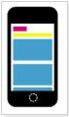
In the Responsive Web Design we designed a webpage by using rows and columns, but it does not look good on a small screen.
With the help of Media Queries we can add a break point, it will behave differently when the size of the screen changes.

<style>
    * {
        box-sizing: border-box;
    }

    .row:after {
        content: "";
        clear: both;
        display: block;
    }

    [class*="col-"] {
        float: left;
        padding: 15px;
    }

    html {
        font-family: "Lucida Sans", sans-serif;
    }

    .header {
        background-color: #b6ff00;
        color: #ffffff;
        padding: 15px;
    }

    .menu ul {
        list-style-type: none;
        margin: 0;
        padding: 0;
    }

    .menu li {
        padding: 8px;
        margin-bottom: 7px;
        background-color: #ff004e;
        color: #ffffff;
        box-shadow: 0 2px 2px rgba(0,0,0,0.12), 0 2px 2px rgba(0,0,0,0.24);
    }

        .menu li:hover {
            background-color: #000000;
        }

    .aside {
        background-color: #ff004e;
        padding: 15px;
        color: #ffffff;
        text-align: center;
        font-size: 14px;
        box-shadow: 0 2px 2px rgba(0,0,0,0.12), 0 2px 1px rgba(0,0,0,0.24);
    }

    .footer {
        background-color: #000000;
        color: #ffffff;
        text-align: center;
        font-size: 12px;
        padding: 15px;
    }
    /* For desktop: Here we are creating for desktop first*/
    .col-1 {
        width: 8.33%;
    }

    .col-2 {
        width: 16.66%;
    }

    .col-3 {
        width: 25%;
    }

    .col-4 {
        width: 33.33%;
    }

    .col-5 {
        width: 41.66%;
    }

    .col-6 {
        width: 50%;
    }

    .col-7 {
        width: 58.33%;
    }

    .col-8 {
        width: 66.66%;
    }

    .col-9 {
        width: 75%;
    }

    .col-10 {
        width: 83.33%;
    }

    .col-11 {
        width: 91.66%;
    }

    .col-12 {
        width: 100%;
    }

    @media only screen and (max-width: 650px) {
        /* For mobile phones: */
        [class*="col-"] {
            width: 100%;
        }
    }
</style>

<div class="header">
    <h1>TechFunda</h1>
</div>

<div class="row">

    <div class="col-3 menu">
        <ul>
            <li>Technologies</li>
            <li>Become Author</li>
            <li>Refer & Earn</li>
            <li>Get Knowledge</li>
        </ul>
    </div>

    <div class="col-6">
        <h1>Free Tutorials</h1>
        <p>TechFunda is a free e Learning tutorial website abailable in the world wide web as, www.techfunda.com</p>
    </div>

    <div class="col-3 right">
        <div class="aside">
            <h2>Benifit?</h2>
            <p>We can learn the Technologies and we can earn the money easily.</p>
            <h2>How?</h2>
            <p>By submitting the technologies what ever we know.</p>
            <h2>Contact</h2>
            <p>You can reach us throus mail ID webmaster@techfunda.com</p>
        </div>
    </div>
</div>

<div class="footer">
    <p>Resize the browser window to see how the content respond to the resizing.</p>
</div>
By using the above code snippet we have created a responsive web home page, by using media queries in CSS3 we added break point at 650 px.
Like this we can add as many as breakpoints by using media Queries, in the above code snippet we have added a break point in between desktop and mobile, in the same way we can add a break point between mobile and tablet as well.
Alwyas design fo mobile first means, designing the web page for mobile before designing for desktop or any other devices.
Designing for the mobile first makes the page display faster on small screens.
For this we must need to change the some CSS code.
While adding breakpoint at 650 px, we designed for desktop first in CSS. In this case insted of desktop we will design for mobile first.
Although the output of both (Designing first for desktop & Designing first for desktop) is same, but desig for mobile first loads the pages fastly in the small screens.
/* For mobile phones: */
        [class*="col-"] {
            width: 100%;
        }

        @media only screen and (min-width: 768px) {
            /* For desktop: */
            .col-1 {
                width: 8.33%;
            }

            .col-2 {
                width: 16.66%;
            }

            .col-3 {
                width: 25%;
            }

            .col-4 {
                width: 33.33%;
            }

            .col-5 {
                width: 41.66%;
            }

            .col-6 {
                width: 50%;
            }

            .col-7 {
                width: 58.33%;
            }

            .col-8 {
                width: 66.66%;
            }

            .col-9 {
                width: 75%;
            }

            .col-10 {
                width: 83.33%;
            }

            .col-11 {
                width: 91.66%;
            }

            .col-12 {
                width: 100%;
            }
        }
Always design for mobile first
In the above code snippet we designed for mobile first and then for the desktop.
We can change the layout of the page depending upon the orientation of the browser.
<style>
    p {
        color: Red;
    }

    @media only screen and (orientation:lansdscape) {
        p {
            color: green;
        }
    }
</style>

<p>Start scaling the browser, as the size of the browser decreases the red color letters changed to the green color.</p>
In the above code snippet we used orientation in media queries, start scaling the browser to find the output.
Views: 4394 | Post Order: 111


