Online: 13134


 Online: 13134
An animation lets an element gradually change from one style to another, to create animation using css we need to use keyframes for the animation
There are different types of animations used in animation, they are
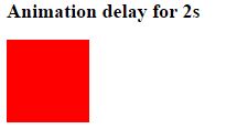
Animation delay is used to delay the animation for given value
 <style>
        div {
            width: 100px;
            height: 100px;
            background-color: red;
            position: relative;

          /* for chrome, safari */
            -webkit-animation-name: example;
            -webkit-animation-duration: 4s;
            -webkit-animation-delay: 2s;

            /* for firefox and safari*/
            -moz-animation-name: example;
            -moz-animation-duration: 4s;
            -moz-animation-delay: 2s;

            /* Standard syntax*/
             animation-name: example;
             animation-duration: 4s;
             animation-delay: 2s;

             /* for opera */
            -o-animation-name: example;
            -o-animation-duration: 4s;
            -o-animation-delay: 2s;
        }

        @-webkit-keyframes example {
            0% {
                background-color: red;
                left: 0px;
                top: 0px;
            }

            50% {
                background-color: blue;
                left: 200px;
                top: 200px;
            }

            100% {
                background-color: red;
                left: 0px;
                top: 0px;
            }
        }

        @-moz-keyframes example {
            0% {
                background-color: red;
                left: 0px;
                top: 0px;
            }

            50% {
                background-color: blue;
                left: 200px;
                top: 200px;
            }

            100% {
                background-color: red;
                left: 0px;
                top: 0px;
            }
        }
         @-o-keyframes example {
            0% {
                background-color: red;
                left: 0px;
                top: 0px;
            }

            50% {
                background-color: blue;
                left: 200px;
                top: 200px;
            }

            100% {
                background-color: red;
                left: 0px;
                top: 0px;
            }
        }
          @keyframes example {
            0% {
                background-color: red;
                left: 0px;
                top: 0px;
            }

            50% {
                background-color: blue;
                left: 200px;
                top: 200px;
            }

            100% {
                background-color: red;
                left: 0px;
                top: 0px;
            }
        }
    </style>
</head>
<body>
    <h2>Animation delay for 2s </h2>
    <div></div>
</body>
output
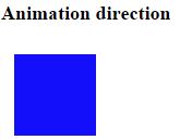
It is used to animate in the given direction
 <style>
        div {
            width: 100px;
            height: 100px;
            background: red;
            position: relative;
            /* for chrome and safari*/
            -webkit-animation: animate 2s infinite;
            -webkit-animation-direction: alternate-reverse;

            /* for safari*/
            -moz-animation: animate 2s infinite;
            -moz-animation-direction: alternate-reverse;

            /*for  opera*/
            -o-animation: animate 2s infinite;
            -o-animation-direction: alternate-reverse;

            /* Standard syntax  */
            animation: animate 2s infinite;
            animation-direction: alternate-reverse;
        }

        @-webkit-keyframes animate {
            0% {
                background: green;
                left: 0px;
                top: 0px;
            }

            50% {
                background: pink;
                left: 200px;
                top: 200px;
            }

            100% {
                background: blue;
                left: 0px;
                top: 0px;
            }
        }
         @-moz-keyframes animate {
            0% {
                background: green;
                left: 0px;
                top: 0px;
            }

            50% {
                background: pink;
                left: 200px;
                top: 200px;
            }

            100% {
                background: blue;
                left: 0px;
                top: 0px;
            }
        }
          @-o-keyframes animate {
            0% {
                background: green;
                left: 0px;
                top: 0px;
            }

            50% {
                background: pink;
                left: 200px;
                top: 200px;
            }

            100% {
                background: blue;
                left: 0px;
                top: 0px;
            }
        }
           @keyframes animate {
            0% {
                background: green;
                left: 0px;
                top: 0px;
            }

            50% {
                background: pink;
                left: 200px;
                top: 200px;
            }

            100% {
                background: blue;
                left: 0px;
                top: 0px;
            }
        }
    </style>
</head>
<body>
    <h2>Animation direction</h2>
    <div></div>
</body>
In the above code snippet we have defined the animation direction, w have given the animation direction as alternate-reverse at 0% it has the color green, at 50% it has the color pink with values left and top as 200 px and at the 100% it has blue color with values left and top as 0 px
output
It animates in given duration of time
 <style>
        div {
            width: 100px;
            height: 100px;
            background: red;
            position: relative;
            /* For chrome and safari*/
            -webkit-animation: animate 2s infinite;
            -webkit-animation-duration: 1s;

            /* For firefox*/
            -moz-animation: animate 2s infinite;
            -moz-animation-duration: 1s;

            /*for opera */
             -o-animation: animate 2s infinite;
             -o-animation-duration: 1s;

            /* standard syntax */
             animation: animate 2s infinite;
             animation-duration: 1s;
        }

        @-webkit-keyframes animate {
            0% {
                background: green;
                left: 0px;
                top: 0px;
            }

            50% {
                background: pink;
                left: 200px;
                top: 200px;
            }

            100% {
                background: blue;
                left: 0px;
                top: 0px;
            }
        }

        @-moz-keyframes animate {
            0% {
                background: green;
                left: 0px;
                top: 0px;
            }

            50% {
                background: pink;
                left: 200px;
                top: 200px;
            }

            100% {
                background: blue;
                left: 0px;
                top: 0px;
            }
        }
         @-o-keyframes animate {
            0% {
                background: green;
                left: 0px;
                top: 0px;
            }

            50% {
                background: pink;
                left: 200px;
                top: 200px;
            }

            100% {
                background: blue;
                left: 0px;
                top: 0px;
            }
        }
          @keyframes animate {
            0% {
                background: green;
                left: 0px;
                top: 0px;
            }
            50% {
                background: pink;
                left: 200px;
                top: 200px;
            }

            100% {
                background: blue;
                left: 0px;
                top: 0px;
            }
        }
    </style>
</head>
<body>
    <h2>Animation duration</h2>
    <div></div>
</body>
In the above code snippet we have animation duration property which is used to animate the function in one second
output

The animation fill mode property specifies how a CSS animation should apply styles to its target before and after it is executing.
It contains different styles they are
Animation-fill-mode:none, farward, backward, initial, inherit
 <style>
        div {
            width: 100px;
            height: 100px;
            background: red;
            position: relative;

            /* for chrome and safari*/
            -webkit-animation: function 1s;
            -webkit-animation-iteration-count: 5;
            -webkit-animation-fill-mode: forwards;

            /* for firefox*/
            -moz-animation: function 1s;
            -moz-animation-iteration-count: 5;
            -moz-animation-fill-mode: forwards;

            /* for opera*/
            -o-animation: function 1s;
            -o-animation-iteration-count: 5;
            -o-animation-fill-mode: forwards;

            /* Standard syntax*/
            animation:function 1s;
            animation-iteration-count:5;
            animation-fill-mode:forwards;
        }

        @-webkit-keyframes function {
            from {
                top: 0px;
            }

            to {
                top: 200px;
            }
        }

        @-moz-keyframes function {
            from {
                top: 0px;
            }

            to {
                top: 200px;
            }
        }
         @-o-keyframes function {
            from {
                top: 0px;
            }

            to {
                top: 200px;
            }
        }
          @keyframes function {
            from {
                top: 0px;
            }

            to {
                top: 200px;
            }
        }
    </style>
</head>
<body>
    <p>Animation fill mode</p>
    <div></div>
</body>
In the above code snippet we have defied the animation fill mode property, it uses animation iteration count for defining animation fill mode property, animation farwards defines the animation will apply the property values for the time the animation ended, we have given iteration count as 5 which displays output five times from top 0px to 200px in red color
output

Animation iteration count
It defines the number of times to display the output
<style>
        div {
            width: 100px;
            height: 100px;
            background: red;
            position: relative;

            /*for chrome and safari*/
            -webkit-animation: function 1s;
            -webkit-animation-iteration-count: 3;

            /*for firefox*/
            -moz-animation: function 1s;
            -moz-animation-iteration-count: 3;

            /* for opera  */
            -o-animation: function 1s;
            -o-animation-iteration-count: 3;

             /* Standard syntax  */
            animation: function 1s;
            animation-iteration-count: 3;
        }

        @-webkit-keyframes function {
            from {
                background-color: green;
                top: 0px;
            }

            to {
                background-color: orange;
                top: 200px;
            }
        }

        @-moz-keyframes function {
            from {
                background-color: green;
                top: 0px;
            }

            to {
                background-color: orange;
                top: 200px;
            }
        }
         @-o-keyframes function {
            from {
                background-color: green;
                top: 0px;
            }

            to {
                background-color: orange;
                top: 200px;
            }
        }
          @keyframes function {
            from {
                background-color: green;
                top: 0px;
            }

            to {
                background-color: orange;
                top: 200px;
            }
        }
    </style>
</head>
<body>
    <h2>Animation iteration count</h2>
    <div></div>
</body>
In the above code snippet we have defined the animation iteration count which is used to define the count of animations , it is usd to animate the given number of times in the output
output

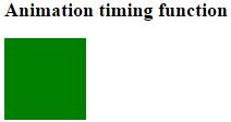
It Plays an animation with the same speed from beginning to end
 <style>
        div {
            width: 100px;
            height: 100px;
            background: green;
            position: relative;

            /* for chrome and safari*/
            -webkit-animation: mymove 5s;
            -webkit-animation-timing-function: linear;

            /*for firefox*/
            -moz-animation: mymove 5s;
            -moz-animation-timing-function: linear;

            /*for opera */
            -o-animation: mymove 5s;
            -o-animation-timing-function: linear;

            /*Standard syntax */
            animation: mymove 5s;
            animation-timing-function: linear;
        }

        @-webkit-keyframes mymove {
            from {
                background-color: red;
                left: 0px;
            }

            to {
                background-color: lemonchiffon;
                left: 200px;
            }
        }

        @-moz-keyframes mymove {
            from {
                background-color: red;
                left: 0px;
            }

            to {
                background-color: lemonchiffon;
                left: 200px;
            }
        }
        @-o-keyframes mymove {
            from {
                background-color: red;
                left: 0px;
            }

            to {
                background-color: lemonchiffon;
                left: 200px;
            }
        }
         @keyframes mymove {
            from {
                background-color: red;
                left: 0px;
            }

            to {
                background-color: lemonchiffon;
                left: 200px;
            }
        }
    </style>
</head>
<body>
    <h2>
        Animation timing function
    </h2>
    <div></div>
</body>
In the above code snippet we have defined the animation timing function as linear which moves the output in the same speed from begining to end
output