Online: 3798


 Online: 3798
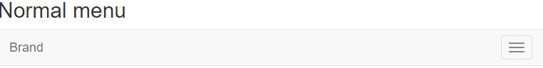
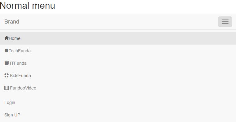
<h2>Normal menu</h2>
    <nav class="navbar navbar-default">
        <div class="navbar-header">
            <button type="button" data-target="#mynavbar" data-toggle="collapse" class="navbar-toggle">
                <span class="sr-only">ToggleNavigation</span>
                <span class="icon-bar"></span>
                <span class="icon-bar"></span>
                <span class="icon-bar"></span>
            </button>
            <a href="#" class="navbar-brand">Brand</a>
        </div>
        <div id="mynavbar" class="collapse navbar-collapse">
            <ul class="nav navbar-nav">
                <li class="active"><a href="#"><span class="glyphicon glyphicon-home"></span>Home</a></li>
                <li><a href="#"><span class="glyphicon glyphicon-certificate"></span>TechFunda</a></li>
                <li><a href="#"><span class="glyphicon glyphicon-book"></span> ITFunda</a></li>
                <li><a href="#"><span class="glyphicon glyphicon-gift"></span> KidsFunda</a></li>
                <li><a href="#"><span class="glyphicon glyphicon-film"></span> FundooVideo</a></li>
            </ul>
        <ul class="nav navbar-nav navbar-right">
            <li><a href="#">Login</a></li>
            <li><a href="#">Sign UP</a></li>
        </ul>
        </div>
    </nav>
navbar-default In the next line we have class attribute value navbar-header in div and we have button with data-target with #mynavbar, data-toggle as collapse with class attribute valuenavbar-toggle and we have anchor tag using class attribute value navbar-brand with value brandmynavbar with class attribute collapse navbar-collapse and we defined class attribute value nav navbar-nav in the ul elements with list values as Home, TechFunda, ITFunda, KidsFunda, Fundoovideonav navbar-nav navbar-right in the ul elements which aligns the given values in the right side of the navbar output
In large screen

If Mobile screen
We can find the toggle navigation to open the list values in the navbar
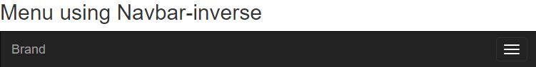
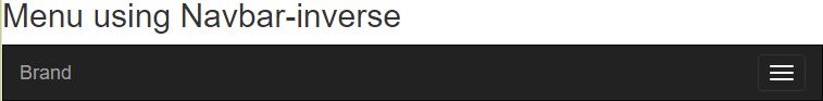
We can create above example program using navbar -inverse, it creates the navbar in black color, we need just to add the navbar-inverse instead of the navbar-default in the nav tag
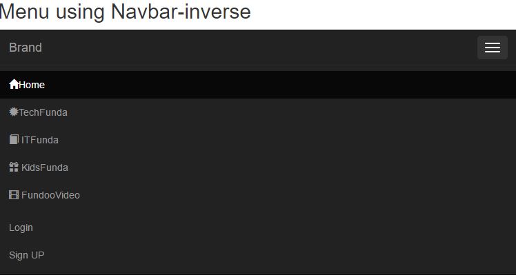
 <h2>Menu using Navbar-inverse</h2>
    <nav class="navbar navbar-inverse">
        <div class="navbar-header">
            <button type="button" data-target="#mynavbar" data-toggle="collapse" class="navbar-toggle">
                <span class="sr-only">ToggleNavigation</span>
                <span class="icon-bar"></span>
                <span class="icon-bar"></span>
                <span class="icon-bar"></span>
            </button>
            <a href="#" class="navbar-brand">Brand</a>
        </div>
        <div id="mynavbar" class="collapse navbar-collapse">
            <ul class="nav navbar-nav">
                <li class="active"><a href="#"><span class="glyphicon glyphicon-home"></span>Home</a></li>
                <li><a href="#"><span class="glyphicon glyphicon-certificate"></span>TechFunda</a></li>
                <li><a href="#"><span class="glyphicon glyphicon-book"></span> ITFunda</a></li>
                <li><a href="#"><span class="glyphicon glyphicon-gift"></span> KidsFunda</a></li>
                <li><a href="#"><span class="glyphicon glyphicon-film"></span> FundooVideo</a></li>
            </ul>
        <ul class="nav navbar-nav navbar-right">
            <li><a href="#">Login</a></li>
            <li><a href="#">Sign UP</a></li>
        </ul>
        </div>
    </nav>
navbar-inverse to create black color navbar-header in div and we have button with data-target with #mynavbar, data-toggle=collapse and value of class attribute value =navbar-toggle and we have anchor tag with class attribute navbar-brand with value brandmynavbar with value of class attribute=collapse navbar-collapse class with nav navbar-nav in ul elements and the list values as Home, TechFunda, ITFunda, KidsFunda, Fundoovideonav navbar-nav navbar-right which aligns the given values in the right side of the navbar output
In large screens

In mobile screens
We find a toggle navigation to click the button to open the list values
Creating navbar menu with search box and dropdown
 <h2>Menu using Navbar-inverse</h2>
    <nav class="navbar navbar-inverse">
        <div class="navbar-header">
            <button type="button" data-target="#navbarCollapse" data-toggle="collapse" class="navbar-toggle">
                <span class="sr-only">Toggle navigation</span>
                <span class="icon-bar"></span>
                <span class="icon-bar"></span>
                <span class="icon-bar"></span>
            </button>
            <a href="#" class="navbar-brand">Brand</a>
        </div>

        <div id="navbarCollapse" class="collapse navbar-collapse">
            <ul class="nav navbar-nav">
                <li class="active"><a href="#"><span class="glyphicon glyphicon-home"></span> Home</a></li>
                <li class="dropdown">
                    <a data-toggle="dropdown" class="dropdown-toggle" href="#"><span class="glyphicon glyphicon-certificate"></span> DotNetFunda <b class="caret"></b></a>
                    <ul role="menu" class="dropdown-menu">
                        <li><a href="#">Articles</a></li>
                        <li><a href="#">Interviews</a></li>
                        <li><a href="#">Forums</a></li>
                        <li class="divider"></li>
                        <li><a href="#">About Us</a></li>
                        <li><a href="#">Contact Us</a></li>
                    </ul>
                </li>
                <li class="dropdown">
                    <a data-toggle="dropdown" class="dropdown-toggle" href="#"><span class="glyphicon glyphicon-book"></span>ITFunda<b class="caret"></b></a>
                <ul role="menu" class="dropdown-menu">
                    <li><a href="#">Online training</a></li>
                    <li><a href="#">Offline Traning</a></li>
                    <li class="divider"></li>
                    <li><a href="#">Contact us</a></li>
                    <li><a href="#">Write Us</a></li>
                </ul>
                </li>
                <li><a href="#"><span class="glyphicon glyphicon-gift"></span> KidsFunda</a></li>
                <li><a href="#"><span class="glyphicon glyphicon-film"></span> FundooVideo</a></li>
            </ul>
            <form role="search" class="navbar-form navbar-left">
                <div class="form-group">
                    <input type="text" placeholder="Search" class="form-control">
                </div>
            </form>
            <ul class="nav navbar-nav navbar-right">
                <li><a href="#">Contact</a></li>
                <li class="dropdown">
                    <a data-toggle="dropdown" class="dropdown-toggle" href="#"><span class="glyphicon glyphicon-user"></span> Manideep <b class="caret"></b></a>
                    <ul role="menu" class="dropdown-menu">
                        <li><a href="#"><span class="glyphicon glyphicon-phone"></span> Friends</a></li>
                        <li><a href="#"><span class="glyphicon glyphicon-envelope"></span> Messages</a></li>
                        <li><a href="#"><span class="glyphicon glyphicon-globe"></span> Notifications</a></li>
                        <li class="divider"></li>
                        <li><a href="#"><span class="glyphicon glyphicon-cog"></span> Settings</a></li>
                        <li><a href="#"><span class="glyphicon glyphicon-off"></span> Logout</a></li>
                    </ul>
                </li>
            </ul>
        </div>
    </nav>
navbar-inverse in the nav element and in the nav element we have taken another div with value of class attribute navbar-header, we created button with data-target=#navbarcollapse anad data-toggle as collapse and class as navbar-toggle, we are having span element with class attribute as sr-only with value Togglenavigation, we have three span elements with class attribute value icon-bar in the button after creating button, we are having <a> tag using class attribute value navbar-brand with value brandnavbarcollapse using value of class attribute navbar-collapse and defining the ul element to define the list values using class attribute value navbar-nav, we created dropdown to the list values DotNetFunda and ITFunda by using value of class attribute dropdown-togglenavbar-form, we have div with class form-group to create input type=text with class form-controlnavbar-right and created dropdown for the value manideep
output
In large screen

In mobile phone