Online: 24606


 Online: 24606
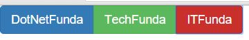
These are used to group the buttons.
<div class="btn-group">
        <button type="button" class="btn btn-primary">DotNetFunda</button>
        <button type="button" class="btn btn-success">TechFunda</button>
        <button type="button" class="btn btn-danger">ITFunda</button>
    </div>
In the above code snippet we have defined<btn-group>. we are having class as btn-group and we are having contextual colors as buttons.
<btn-group>-renders to group the buttonsoutput
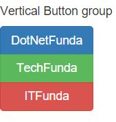
It is used to group the button vertical
 <h5>Vertical Button group</h5>
    <div class="btn-group-vertical">
        <button type="button" class="btn btn-primary">DotNetFunda</button>
        <button type="button" class="btn btn-success">TechFunda</button>
        <button type="button" class="btn btn-danger">ITFunda</button>
    </div>
In the above code snippet we have vertical button group. We are having class as
<btn-group-vertical> - displays the group in the verticaloutput
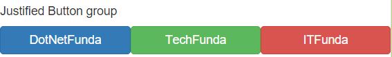
Justified button group is used to span entire the width of the screen
<h5>Justified Button group</h5>
    <div class="btn-group-justified">
        <a href="http://www.dotnetfunda.com" class="btn btn-primary">DotNetFunda</a>
        <a href="http://www.techfunda.com" class="btn btn-success">TechFunda</a>
        <a href="http://www.itfunda.com" class="btn btn-danger">ITFunda</a>
    </div>
In the above code snippet we have taken class as btn-group-justified. ew have given <a> tags to determine the justified button group
btn-group-justified>- renders the button group with full width to the screenoutput
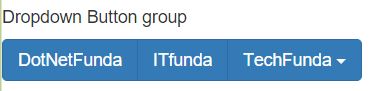
This is used to keep the drop down menu to the buttons.
<h5>Dropdown Button group</h5>
    <div class="btn-group">
        <button type="button" class="btn btn-primary">DotNetFunda</button>
        <button type="button" class="btn btn-primary">ITfunda</button>
        <div class="btn-group">
            <button type="button" class="btn btn-primary dropdown-toggle" data-toggle="dropdown">
                TechFunda <span class="caret"></span>
            </button>
            <ul class="dropdown-menu" role="menu">
                <li><a href="#">Bootstrap</a></li>
                <li><a href="#">JavaScript</a></li>
                <li><a href="#">AngularJs</a></li>
                <li><a href="#">ASP.NET</a></li>
                <li><a href="#">c#</a></li>
                <li><a href="#">HTML5</a></li>
            </ul>
        </div>
    </div>
In the above code snippet we have defined how to use drop down menu in the list. we have taken class as btn-group and we have taken dropdown menu as dropdown-toggle. and span as caret which defines the icon to drop down and we have ul class to list the li values in the drop down menu.
<dropdown toggle> -renders the button to drop down menu as lists output
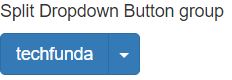
Split buttons are used to split the buttons with drop down menu
<h5>Split Dropdown Button group</h5>
    <div class="btn-group">
        <button type="button" class="btn btn-primary">techfunda</button>
        <button type="button" class="btn btn-primary dropdown-toggle" data-toggle="dropdown">
            <span class="caret"></span>
        </button>
        <ul class="dropdown-menu" role="menu">
            <li><a href="#">javascript</a></li>
            <li><a href="#">Bootstrap</a></li>
        </ul>
    </div>
In the above code snippet we have defined how to use drop down menu with spilt button in the list. we have taken class as btn-group and we have taken dropdown menu as dropdown-toggle. and span as caret which defines the icon to drop down and we have ul class to list the li values in the drop down menu.
output
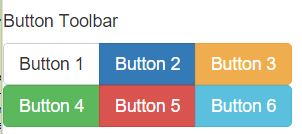
Buttun tool bar s used to create the tool bar
 <h5>Button Toolbar</h5>
    <div class="btn-toolbar" role="toolbar">
        <div class="btn-group">
            <button type="button" class="btn btn-default">Button 1</button>
            <button type="button" class="btn btn-primary">Button 2</button>
            <button type="button" class="btn btn-warning">Button 3</button>
        </div>

        <div class="btn-group">
            <button type="button" class="btn btn-success">Button 4</button>
            <button type="button" class="btn btn-danger">Button 5</button>
            <button type="button" class="btn btn-info">Button 6</button>
        </div>
    </div>
Button Tool bar is used to create the tool bar we have taken class as tool bar and role as tool bar and we have defined the group of the buttons in the output
output
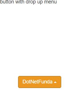
It is used to add the drop up menu to the button group.
<h5>button with drop up menu</h5>
    <div class="row" style="margin-left:50px; margin-top:200px">

        <div class="btn-group dropup">
            <button type="button" class="btn btn-warning dropdown-toggle" data-toggle="dropdown">
                DotNetFunda
                <span class="caret"></span>
            </button>

            <ul class="dropdown-menu" role="menu">
                <li><a href="#">Forums</a></li>
                <li><a href="#">Artciles</a></li>
                <li><a href="#">CareerAdvice</a></li>
            </ul>
        </div>

    </div>
In the above code snippet we have defined how to use drop up menu in the list. we have taken class as btn-group and we have taken drop down menu as dropdown-toggle. and span as caret which defines the icon to drop down and we have ul class to list the li values in the drop down menu.
<drop up>- renders the list to appear to upwardsoutput
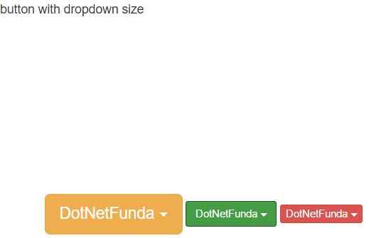
It is used to set the size of the drop down size
<h5>button with dropdown size</h5>
    <div class="row" style="margin-left:50px; margin-top:200px">

        <div class="btn-group">
            <button type="button" class="btn btn-warning dropdown-toggle btn-lg" data-toggle="dropdown">
                DotNetFunda
                <span class="caret"></span>
            </button>

            <ul class="dropdown-menu" role="menu">
                <li><a href="#">Forums</a></li>
                <li><a href="#">Artciles</a></li>
                <li><a href="#">CareerAdvice</a></li>
            </ul>
        </div>


        <div class="btn-group">
            <button type="button" class="btn btn-success dropdown-toggle btn-sm" data-toggle="dropdown">
                DotNetFunda
                <span class="caret"></span>
            </button>

            <ul class="dropdown-menu" role="menu">
                <li><a href="#">Forums</a></li>
                <li><a href="#">Artciles</a></li>
                <li><a href="#">CareerAdvice</a></li>
            </ul>
        </div>
        <div class="btn-group">
            <button type="button" class="btn btn-danger dropdown-toggle btn-xs" data-toggle="dropdown">
                DotNetFunda
                <span class="caret"></span>
            </button>

            <ul class="dropdown-menu" role="menu">
                <li><a href="#">Forums</a></li>
                <li><a href="#">Artciles</a></li>
                <li><a href="#">CareerAdvice</a></li>
            </ul>
        </div>
    </div>
In the above code snippet we have defined how to keep the size of the dropdown button group. we have class as button group and we are having
<btn-lg>-renders the button as large <btn-sm>-renders the button size as small.<btn-xs>-renders the button as extra smalloutput