 Online: 9213


 Online: 9213
Images in responsive web design are nothing but when the user starts scaling the browser, the images in the web page adjusts automatically without croping.
If we set the width property 100%, the image will responsive on the webpage and we can scale up and down (Horizontally).
NOTE: Scale the browser horizontally, so that image adjusts automatically. If we scale the browser vertically the image will not adjust automatically, it will crop as per the size.
<style>
.class {
width:100%;
height:auto;
}
</style>
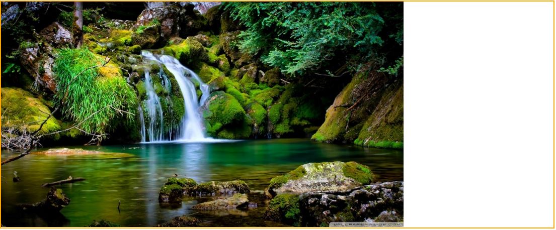
<img src="beautiful-waterfalls-sceneries-wallpaper-1.jpg" class="class"/>
In the above code snippet we used width property in the CSS to get the responsive image while scaling from up and down.
NOTE: Scale the above output horizontally, so that the size of the image adjusts with the size of the browser without croping.
If we set the max-width property 100%, the image will scale down but never scale up to be larger than its exact size.
    <style>
        .class {
        max-width:100%;
        height:auto;
        }
    </style>

    <img src="beautiful-waterfalls-sceneries-wallpaper-1.jpg" class="class"/>
In the above code snippet we used max-width property, this property makes the image scalable upto its original size.
  <style>
        .class {
        width:100%;
        height:auto;
        }
    </style>

    <img src="beautiful-waterfalls-sceneries-wallpaper-1.jpg" class="class"/>
We are keeping the image in the example web page.
Upto now we have seen only resizing the images in the webpage, here we will learn resizing the background images of the webpage.
We can resize the background images also which responds while scaling.
<style>
    p {
        width: 100%;
        background-image: url('beautiful-waterfalls-sceneries-wallpaper-1.jpg');
        height:650px;
        background-size:contain;
        background-repeat:no-repeat;
        border:2px solid orange;
    }
</style>

<p></p>
In the above code snippet we have given background-size: contain it will make the image resize from its original size.
OUTPUT
<style>
    p {
        width: 100%;
        background-image: url('beautiful-waterfalls-sceneries-wallpaper-1.jpg');
        height:650px;
        background-size:100% 100%;
        background-repeat:no-repeat;
        border:2px solid blue;
    }
</style>

<p></p>
In the above code snippet we have given background-size: 100% 100%, that will make the background image strechable along with the webpage. That means image covers the whole webpage and resizes itself once the browser starts scaling.
OUTPUT

<style>
    p {
        width: 100%;
        background-image: url('beautiful-waterfalls-sceneries-wallpaper-1.jpg');
        height:650px;
        background-size:cover;
        background-repeat:no-repeat;
        border:2px solid blue;
    }
</style>

<p></p>
In the above code snippet we used background-size: cover, it will scale the background image to cover image, that means certain portion of the image streches along with the whole web page. To observe the original image the user needs to scale the browser.
OUTPUT


