Online: 10056


 Online: 10056
Gradients are used to create design by creating multicolors in the webpage, there are two types of gradients they are
It creates the linear transition of the color from one color to another color in one direction to other direction
To add the linear gradient we need to use the following
Direction:Lineargradient(direction, startcolor, stopcolor)
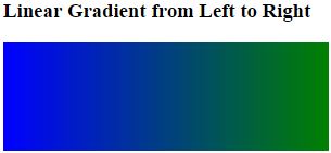
It adds the color from left side to right side
<style>
        #grad {
            height: 100px;
            width:300px;
            background: -webkit-linear-gradient(left, blue, green);
        }
    </style>
</head>
<body>
    <h3>Linear Gradient from Left to Right</h3>
    <div id="grad"></div>
</body>
In the above code snippet we have linear gradient color from left to right, we use height , width property to define the color, we defined the lineargradient in the #grad and given in the div sectoin to create color
background: -webkit-linear-gradient(left, blue, green); -It starts the color from left to right with the given color
output
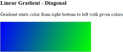
Diagonal specifies colors both from horizontal and vertical shape
 <style>
        #grad {
            height: 100px;
            width:300px;
            background: -webkit-linear-gradient(right bottom, lime, blue);
        }
    </style>
</head>
<body>

    <h3>Linear Gradient - Diagonal</h3>
    <p>Gradient starts color from right bottom to left with given colors</p>
    <div id="grad"></div>
</body>
In the above code snippet we have gradient with diagonal which creates the color with vertical and horizontal shape by using (rightbottom, lime, blue), creates color from right bottom to left with given colors
output
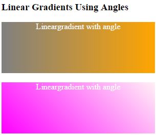
It creates colors with angles
<style>
        #grad1 {
            height: 100px;
            width:300px;
            background: -webkit-linear-gradient(180deg, orange, grey);

        }
        #grad2 {
            height: 100px;
            width:300px;
            background: -webkit-linear-gradient(45deg, magenta, lavenderblush);
        }


    </style>
</head>
<body>
    <h3>Linear Gradients Using Angles</h3>
    <div id="grad1" style="color:white;text-align:center;">Lineargradient with angle</div><br>
    <div id="grad2" style="color:white;text-align:center;">Lineargradient with angle</div><br>
</body>
In the above code snippet we have used the gradients with colors with the angle values as 45deg and 180 deg which creates colors
output
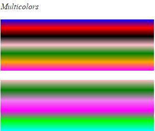
We can create multicolors in gradients by using different colors in the lineargradient
 <style>
        #grad1 {
            height: 100px;
            width:300px;
            background: -webkit-linear-gradient(blue, red, black, pink, green, orange, magenta);

        }
        #grad2 {
            height: 100px;
            width:300px;
            background: -webkit-linear-gradient(pink, green, violet, magenta, lime, cyan);
        }
    </style>
</head>
<body>
    <p><i>Multicolors</i></p>
    <div id="grad1"></div>
    <br/>
    <div id="grad2"></div>
</body>
In the above code snippet we have multicolors by giving different colors in the background
output
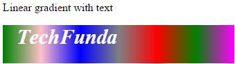
We can create text in gradient
<style>
        #grad1 {
            height: 55px;
            width:50%;
            background: -webkit-linear-gradient(left, green, pink, blue, grey, red,green, magenta);
        }
    </style>
</head>
<body>
    <p>Linear gradient with text</p>
    <div id="grad1" style="color:white;font-size:30px;padding-left:20px;font-weight:bold;font-style:italic;">
        TechFunda
    </div>
</body>
In the above code snippet we have text in the gradient by using text in the div section, it creates text
output
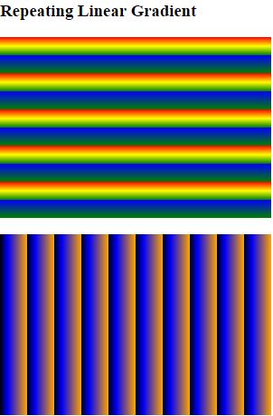
We can create repeated colors using %
 <style>
        #grad1 {
            height: 200px;
            width:300px;
            background: -webkit-repeating-linear-gradient(red, yellow 5%, green 10%, blue 10%, green 20%);
        }

        #grad2 {
            height: 200px;
            width:300px;
            background: -webkit-repeating-linear-gradient(180deg,orange,blue 7%,black 10%);
        }
    </style>
</head>
<body>
    <h3>Repeating Linear Gradient</h3>
    <div id="grad1"></div>
    <br/>
    <div id="grad2"></div>
</body>
Linear gradient with repeated colors
In the above code snippet we have defined repeated colors by using %property to create repeated colors
output
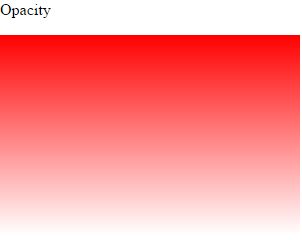
We can create color using opacity
<style>
        #grad1 {
            height: 200px;
            width:300px;
            background: -webkit-linear-gradient(bottom, rgba(280,0,0,0), rgba(255,0,0,1));
        }
    </style>
</head>
<body>
    <p>Opacity</p>
    <div id="grad1"></div>
</body>
In the above code snippet we have created color using opacity rgba() and rgba() to start and stop colors
output
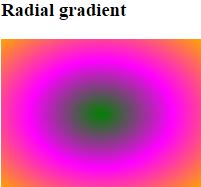
It creates colors in the form of circle shape
  <style>
        #grad1 {
            height: 150px;
            width: 200px;
            background: -webkit-radial-gradient(green, magenta, orange);
        }
    </style>
</head>
<body>

    <h3>Radial gradient</h3>
    <div id="grad1"></div>
</body>
In the above code snippet we have created colors in the form of circular shape by using radial gradient with color green, magenta, orange
output
<style>
#grad1 {
height: 150px;
width: 200px;
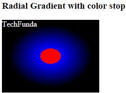
background: -webkit-radial-gradient(red 15%, blue 15%, black 60%);
}
</style>
</head>
<body>
<h3>Radial Gradient with color stop</h3>
<div id="grad1" style="color:white;">TechFunda</div>
</body>
In the above code snippet we have radialgradient with color stop by using the value Color(%) to increase or decrease the color
output
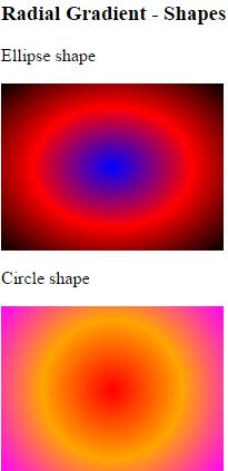
We can create shapes in radial gradient
 <style>
        #grad1 {
            height: 150px;
            width: 200px;
            background: -webkit-radial-gradient(blue, red,black);
        }
        #grad2 {
            height: 150px;
            width: 200px;
            background: -webkit-radial-gradient(circle, red, orange, magenta);
        }
    </style>
</head>
<body>
    <h3>Radial Gradient - Shapes</h3>
    <p>Ellipse shape</p>
    <div id="grad1"></div>
    <p>Circle shape</p>
    <div id="grad2"></div>
</body>
Radial gradient shapes
In the above code snippet we have created shapes by using radial gradient(circle, colors)
output
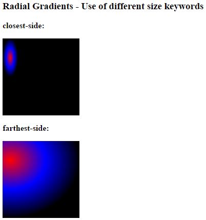
We can create different sizes in the radial gradient
<style>
        #grad1 {
            height: 150px;
            width: 150px;
            background: -webkit-radial-gradient(10% 25%, closest-side, red, blue, black);
        }

        #grad2 {
            height: 150px;
            width: 150px;
            background: -webkit-radial-gradient(10% 25%, farthest-side, red, blue, black);
        }

        #grad3 {
            height: 150px;
            width: 150px;
            background: -webkit-radial-gradient(10% 25%, closest-corner, red, blue, black);
        }

        #grad4 {
            height: 150px;
            width: 150px;
            background: -webkit-radial-gradient(10% 25%, farthest-corner, red, blue, black);
        }
    </style>
</head>
<body>
    <h3>Radial Gradients - Use of different size keywords</h3>
    <p><strong>closest-side:</strong></p>
    <div id="grad1"></div>
    <p><strong>farthest-side:</strong></p>
    <div id="grad2"></div>
    <p><strong>closest-corner:</strong></p>
    <div id="grad3"></div>
    <p><strong>farthest-corner </strong></p>
    <div id="grad4"></div>
</body>
In the above code snippet we have radial gradient with sizes by using (value %) with closet and farthest corners
output
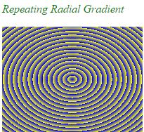
It repeats the radial gradient
 <style>
        #grad1 {
            height: 150px;
            width: 200px;
            background: -webkit-repeating-radial-gradient(blue , yellow 5%, grey 5%);

        }
    </style>
</head>
<body>
    <p style="color:green;"><i>Repeating Radial Gradient</i></p>
    <div id="grad1"></div>
</body>
In the above code snippet we have defined repeated radial gradient, we have (value 5%) to define the repeat method
output