Online: 7122


 Online: 7122
A progress bar is a graphical control element used to visualize the progression of an extended computer operation, It is defined as textual represntation of the percent form.
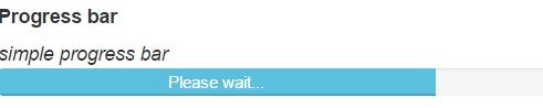
 <h5><b>Progress bar</b></h5>
    <i> simple progress bar</i>
    <div class="progress">
        <div class="progress-bar progress-bar-info" style="width: 70%;">
            Please wait...
        </div>
    </div>
In the above code snippet we have defined how to use progress bar. We have taken class as progress and in the div section we are having class as progress bar progress bar info as color contextual color with a wisth of 70 %.
output
It is used to strip the progress bar
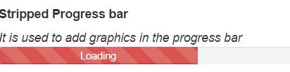
 <h5><b> Stripped Progress bar</b></h5>
    <i> It is used to add graphics in the progress bar</i>
    <div class="progress progress-striped">
        <div class="progress-bar progress-bar-danger" style="width: 50%;">
            Loading
        </div>
    </div>
In the above code snippet we defined the stripped progress bar. We declared class as progress stripped and in the div section we are having class as progress bar danger as contextual color of the danger in redcolor with th width of 50 %
output
If you want an active progress bar in which stripes are moving linearly, Add active to the above striped progress bar
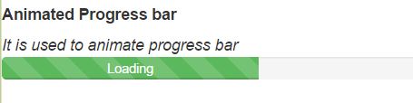
<h5><b> Animated Progress bar</b></h5>
    <i> It is used to animate progress bar</i>
    <div class="progress progress-striped active">
        <div class="progress-bar progress-bar-success" style="width: 50%;">
            Loading
        </div>
    </div>
In the above code snippet we have define the animated stripped progress bars. We have taken class as progress stripped and active to add the animation and in the div section we have taken class as progress bars as success and style as width of 50 %
output
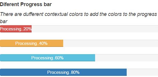
Progress bars contains different colors as contextual colors.
<h5><b> Diferent Progress bar</b></h5>
    <i> There are dufferent contextual colors to add the colors to the progress bar </i>
    <div class="progress">
        <div class="progress-bar progress-bar-danger" style="width: 20%">
            Processing..20%
        </div>
    </div>
    <div class="progress">
        <div class="progress-bar progress-bar-warning" style="width: 40%">
            Processing..40%
        </div>
    </div>
    <div class="progress">
        <div class="progress-bar progress-bar-info" style="width: 60%">
            Processing..60%
        </div>
    </div>
    <div class="progress">
        <div class="progress-bar" style="width: 80%">
            Processing..80%
        </div>
    </div>
    <div class="progress">
        <div class="progress-bar progress-bar-success" style="width: 100%">
            Done..100%
        </div>
    </div>
In the above code snippet we have defined the different colors of the progress bars.
<div class="progress-bar progress-bar-success">-renders the green color<div class="progress-bar progress-bar-primary">-renders the light blue color <div class="progress-bar progress-bar-warning">-renders the red color<div class="progress-bar progress-bar-info">-renders the light coloroutput
These are used to add different colors and stripped and active classes
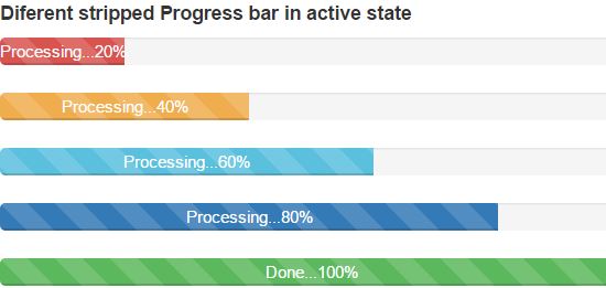
 <h5><b> Diferent stripped Progress bar in active state</b></h5>
    <div class="progress progress-striped">
        <div class="progress-bar progress-bar-danger" style="width: 20%">
            Processing...20%
        </div>
    </div>
    <div class="progress progress-striped">
        <div class="progress-bar progress-bar-warning" style="width: 40%">
            Processing...40%
        </div>
    </div>
    <div class="progress progress-striped active">
        <div class="progress-bar progress-bar-info" style="width: 60%">
            Processing...60%
        </div>
    </div>
    <div class="progress progress-striped">
        <div class="progress-bar" style="width: 80%">
            Processing...80%
        </div>
    </div>
    <div class="progress progress-striped">
        <div class="progress-bar progress-bar-success" style="width: 100%">
            Done...100%
        </div>
    </div>
Different stripped and active state progress bars
In the above code snippet we have defined contextaul colors and active class.
<div class="progress progress-striped">-renders the progress bar with strips.<div class="progress-bar progress-bar-danger">- renders the color of the strips.<div class="progress progress-striped active"> -renders the strip as animated output
We can create the multiple progress bars in a single progress bar
 <h5><b>Stacked progress bar</b></h5>
    <div class="progress">
        <div class="progress-bar progress-bar-danger" style="width:15%">
            dotnetfunda
        </div>
        <div class="progress-bar progress-bar-warning" style="width:15%">
            techfunda
        </div>
        <div class="progress-bar progress-bar-striped progress-bar-danger active" style="width:30%">
            ItFunda
        </div>
        <div class="progress-bar progress-bar-success" style="width:20%">
            Kidsfunda
        </div>
        <div class="progress-bar progress-bar-striped" style="width:20%">
            Farmingfunda
        </div>

    </div>
In the above code snippet we have defined the multiple progress bars in a single progress bar. we have defined class as a progress bar and in that class we have taken div sections to create multiple progres bars in a single progress bars.
output